Chances are if you’ve been searching for the perfect white paint, or planning a new palette for your home, you’ve come across the Farrow & Ball label. It’s slightly cliche, but Farrow & Ball really does have a cult following among interior designers.
In this post you’ll learn:
- How to Choose the Best Farrow and Ball Paint Colors
- Designer’s Best Farrow and Ball Paint Colors
- The Prettiest Warm Neutrals
- The Best Cool Neutrals
- Designer Favorite Bold Choices
- Designer Top Favorites
- Classic Whites
- Understanding the F&B Finishes
- Light Considerations
- Professional Application Guide
- Personalized Paint Guide
- Tools & Tips That Actually Work
- Conclusion
- Explore all about Paints and Finishes
- Little Black Book of Color
The best Farrow & Ball paint colors stand out for a reason that’s immediately visible but hard to pin down. It could be how Skimming Stone stays warm without a yellow cast. Or De Nimes, which reads as the perfect gray-blue without committing to either.
Of course, other paint brands offer a sophisticated palette, but F&B colors have a richness about them that has earned their cult following.
I’ve watched Peignoir shift from cool neutral at breakfast to a gorgeous mauve by dinner. It’s all in their formula, their saturated pigments create depth that most paints struggle to match.
Before we get any further, I must mention their famous chalky finish. It’s become the F&B signature look in polished interiors, but it’s the color complexity that keeps us professionals coming back. Even the whites (from crisp ‘Wimborne’ to mellow ‘James White’) carry subtle undertones that can make a room’s ambiance significantly better designed.
There’s more to Farrow & Ball than their pretty names and Instagram notoriety, but before I share my favorite F&B colors (and oh, I will), let’s chat about the essentials, starting with finishes and the signature sheens that set them apart.
How to Choose the Best Farrow and Ball Paint Colors
As an interior designer, selecting the perfect paint color is a skill I’ve honed over the years of client work. If you’ve watched any of my YouTube videos on paint, or read my blog posts on picking the perfect paint palette for your home, you know that understanding how natural light affects your space is one of the best ways to pick the perfect paint.
Paint transforms with natural light, so before we discuss specific shades, let’s look at how your windows’ direction shapes everything:
- North-facing rooms tend to cast cool, bluish light all day. Warmer, richer shades work best in these instances as they balance out that coolness rather than amplify it. Mid to deep tones also hold up well, while very pale colors can look flat and lifeless.
- South-facing spaces flood with warm light, which intensifies every color. What looks subtle on a paint chip might feel overwhelming in these spaces. Softer, muted tones often work best as they stay balanced even in bright sunlight. Just be careful with very pale shades, as they can wash out.
- East-facing rooms get crisp morning light, but turn cooler and shadowy by afternoon. You’ll want a color that can handle both moods. Medium tones with a slight warmth are most versatile here, adapting gracefully as the light changes.
- West-facing rooms deal with that strong afternoon glow. Colors look warmer and more intense as the day progresses. Neutral mid-tones usually manage this shifting light best. Anything too pale can glare in the afternoon, while dark colors might feel heavy.
get one on one design advice: Book a session with me!
Get expert design advice to pick the perfect paint color, design your room, and finish that space in your home.
Designer’s Best Farrow and Ball Paint Colors
While other brands chase color trends, F&B has spent decades perfecting shades that provide a timeless look. Here’s why these colors keep showing up in most spaces.
The Prettiest Warm Neutrals
Dropcloth
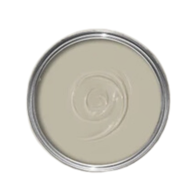
Dropcloth isn’t your average greige. Named after painters’ dust sheets (a nice nod to the trade), it sits between grey and beige without leaning too far either way.
It works particularly well with Shaded White or Shadow White if you’re coating the entire house.
Pro Tip: It’s warmer than it looks on the swatch, making it a good choice for Victorian terraces and modern builds.
Skimming Stone
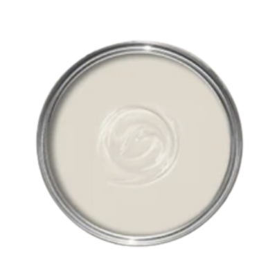
Skimming Stone is one of F&B’s most popular shades for good reason. With its warm light gray undertones, it reads differently throughout the day, particularly suited to soothing bedroom schemes.
Hay
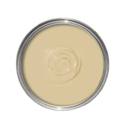
Hay brings a sun-baked warmth that’s become one of the brand’s top-selling shades.
Named after sun-dried crops (which tells you everything about its warmth), it has a lovely lived-in quality that pure yellows can’t touch. The subtle green undertone gives a space an established feel rather than chirpy.
Pair it with Lime White woodwork and watch your room transform.
The Best Cool Neutrals
French Gray
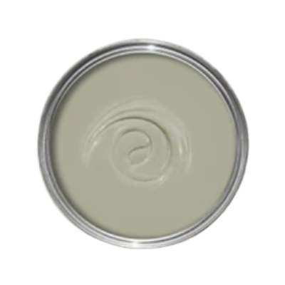
French Gray is technically grey but has a strong green essence to it. Some hours, it reads more grey; others, it’s definitely green. The name’s a nod to 19th-century French decor, so it has a very classic feel about it and is perfect for a library.
It also shines on front doors and garden furniture, where it looks like it naturally belongs in a French setting. Inside, it can make rooms feel calmer.
I love using this color in a “Color Drenching” setting on the trim ceiling and millwork.
Slipper SATIN
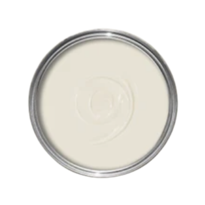
Slipper Satin is that rare neutral that works in modern and traditional spaces. Its delicate cool undertones are particularly striking in rooms with plenty of natural light.
I absolutely love this color as a great base white for entire homes. It works best in a home that has warm natural light throughout.
Designer Favorite Bold Choices
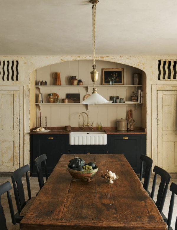
Book Room Red
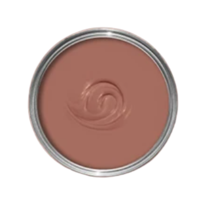
Book Room Red delivers an incredibly rich look that’s both dramatic and livable.
Think English manor libraries and well-worn leather chairs. It features a muddy, terracotta depth that is absolutely perfect for libraries, laundry rooms, pantries, and even bedrooms. Less shouty than Eating Room Red, but just as dramatic.
De Nimes
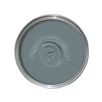
De Nimes has an elegant blue feel with incredible depth. It’s probably one of my most very favorite F&B colors as an interior designer.
It’s become a favorite for blue kitchen cabinetry, built-ins, and powder bathrooms. This is an amazing blue paint color from Farrow & Ball that you should absolutely consider in your home!
Designer Top Favorites
Pigeon
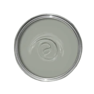
Pigeon captures that perfect London sky blue-grey, named after the city’s most familiar birds!
Less stark than Mole’s Breath, Pigeon has an inviting quality that works perfectly in studies, boot rooms, and even bedrooms.
Also a great option for kitchen cabinetry! As a design team, we all love this shade!
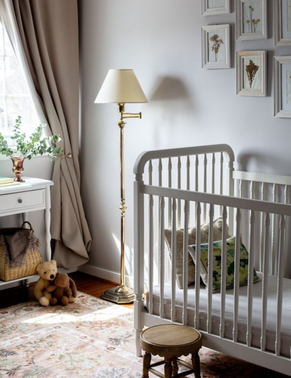
Peignoir
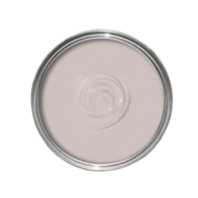
Peignoir might be the most sophisticated of the popular pinks, with a gray undertone that keeps it elevated.
It’s versatile and pairs well with deeper tones like Brassica and Pelt. For the perfect finish, try it with Strong White trim.
We absolutely love using Peignoir as a subtle shade of pink for nurseries, and I even used it as the color for my dining room!
Classic Whites
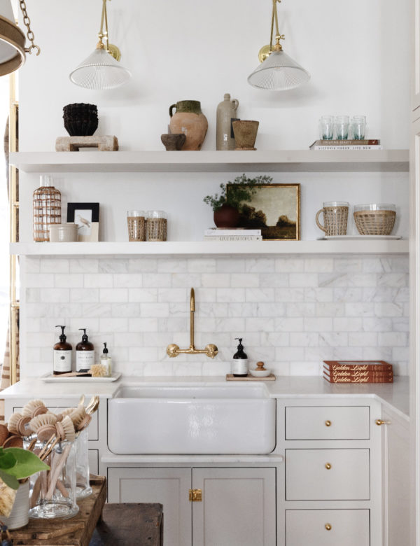
Wimborne White
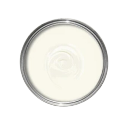
Wimborne White stands as one of F&B paint’s most versatile whites. Unlike stark whites, it carries warm undertones, making it a good choice for south-facing rooms where natural warmth enhances its depth.
James White
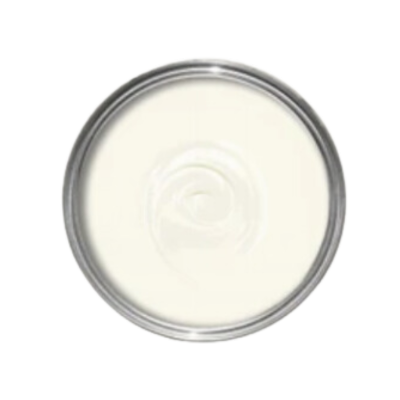
As interior designers, James White is what we often reach for when we need a white with personality.
It’s features the faintest green cast that makes it feel fresh and alive. It’s particularly good at brightening up darker corners without looking stark.
On its own, it creates a serene vibe (perfect for bedrooms). Pair it with All White or put it in a north-facing room to make the subtle green undertone more prominent.
This is a great white for an entire home or an exterior!
Old White
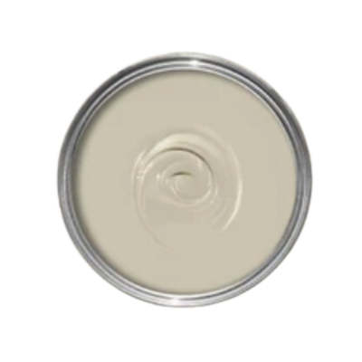
Old White lives up to its name with a complexity that’s hard to match. This happens to be my favorite “white” by F&B, but it’s actually more of a taupe.
Among the different shades of White, it has enough of a creamy undertone to feel authentic in period properties. Which I love, because it has a very timeless feel to it.
Unlike Benjamin Moore or Sherwin Williams alternatives, Old White has a unique chalky quality that sets it apart and makes it an excellent option for walls. Pair with Slipper Satin trim and you home will look elevated and professionally designed.
Understanding the F&B Finishes
Farrow & Ball’s sheen options are unique in nature, they offer fewer finish options than most paint brands by keeping it simple with a few carefully crafted sheens.
F&B finishes are designed to showcase what makes their colors unique: depth, subtle shifts, and their trademark soft glow.
If you’re switching from another brand, know that F&B’s “matte” or “gloss” might not match what you’re used to.
Here’s a breakdown of Farrow & Ball’s Finishes, explained…
Estate Emulsion
If you’ve ever swooned over velvety-looking interior walls in design magazines, you were probably looking at Estate Emulsion.
It’s F&B’s signature finish, and with a super-low 2% sheen, it’s about as matte as paint gets without going completely dead flat.
What makes Estate Emulsion a popular choice for interior spaces? The chalky, almost powder-soft look gives F&B colors their characteristic depth. The finish has an extraordinary response to light and subtly shifts throughout the time of day.
You can purchase Estate Emulsion in 2.5L tins (covers 35m²), or 5L tins (covers 70m²). It’s water-based, low-VOC, and doesn’t have an odor while it dries. Speaking of drying, allow two hours between coats.
Where to use Estate Emulsion? It’s perfect for low-traffic areas like bedrooms and living rooms. I wouldn’t put it in a kitchen or bathroom, though, while this finish is wipeable, it’s not meant for heavy scrubbing. For those spaces, you’ll want something with a bit more durability.
You can clean Farrow & Ball paint easily with soap and water.
Estate Eggshell
Estate Eggshell is a bit tougher than Estate Emulsion. One of the best Farrow and Ball Paint sheens. Not too shiny, not too flat, it sits at 20% sheen and can hold up to spills and everyday life.
As designers, this is our go-to for kitchen cabinets, furniture, and woodwork.
Like Estate Emulsion, Estate Eggshell dries quickly. Water-based and low-VOC with very little odor, it can be cleaned with just soap and water.
Pro Tip: If you’re painting cabinets or anything that’ll see heavy use, be sure to allow time for the paint to cure.
modern emulsion
Modern Emulsion stands out in F&B’s lineup for its resilience. With 7% sheen and durability, it’s particularly well-suited for interior spaces that see daily wear.
While sampling F&B colors for our clients, I found it handles moisture and marks better than most, perfect for kitchen cabinets and bathrooms.
Modern Emulsion dries in 2 hours, and requires 4 hours before re-coating. It comes in 2.5L or 5L tins, covering 30m² and 60m² respectively. The finish fights off mold, scuffs, and stains while keeping that elevated F&B look.
Specialist Finishes
F&B’s Specialist Finishes bring back traditional paint methods that preserve historic charm. The range includes Dead Flat, Casein Distemper, Soft Distemper, and Limewash, each designed to protect and enhance period features in older properties.
These finishes let walls breathe, which helps maintain the integrity of historic interior walls.
Unlike modern paints, these finishes create subtle depth variations that give interior spaces authentic character.
The Limewash works well on exterior walls. Soft Distemper gives delicate surfaces a powdery matte finish that’s true to original techniques. For renovators working with heritage properties, these finishes offer authenticity that modern paints can’t match.
Full Gloss
F&B’s Full Gloss lives up to its name: its 95% sheen is unmatched. The finish holds strong against moisture, keeps its color for up to six years, and works beautifully on wood, metal, and walls both inside and out.
Available in all F&B colors, it comes in 750ml and 2.5L tins. The finish dries in two hours and needs four hours between coats.
Note: while it works on most surfaces, it’s unsuitable for exterior plastics or decking.
Exterior Masonry
F&B’s Exterior Masonry allows walls to breathe while keeping water out. There’s a reason it’s among the best Farrow and Ball paint finishes for outdoor work. The finish will last 15 years without flaking or fading.
F&B Exterior Masonry 5L tin covers 40m² and comes in 107 colors. It needs about two hours to dry and five before the next coat. Don’t put it on lime render or fletton bricks; it won’t work there. However it’s great at keeping mold and algae at bay while maintaining that classic matte look on other masonry.
Exterior Eggshell
If you’re tired of repainting your outdoor space every other year, F&B’s exterior eggshell might be what you need. With its silky 20% sheen, it’s brilliant on everything from front door upgrades to window frames and metal guttering.
F&B added resin tech that moves with the weather (expands when hot, contracts when cold) so you won’t see any flaking for six years.
An eco-friendly, high quality finish, it comes in 750ml tins for smaller jobs or 2.5L for bigger projects.
It needs two hours to dry and four before the next coat to achieve that perfect outdoor finish that lasts.
What is your design style?
Take our complimentary quiz to find your design aesthetic and the perfect accompanying white paint color in less than two minutes!
Light Considerations
As a designer, I can’t stress enough that the perfect paint color you loved at your friend’s house might look different in yours. Light changes everything. So it’s important to consider all elements of the best Farrow & Ball paint colors before purchasing your paint.
Natural Light
South-facing spaces get direct sunlight most of the day, intensifying warm tones and brightening cool ones. In these rooms:
- Warm neutrals like Hay can become overwhelming
- Cool grays provide balance and prevent the space from feeling too warm
- Colors appear closest to their true shade between 10 AM and 2 PM
North-facing rooms receive cooler, indirect light that can make colors appear muted:
- Blues and greens become more prominent in complex neutrals
- Warm colors like Setting Plaster help counteract the cool light
- White paints often show their undertones more clearly
Daily light shifts affect your colors too:
- Morning light tends to be warmer, enhancing pink and yellow undertones
- Midday sun shows colors at their clearest and brightest
- Evening brings out warmer tones, especially in neutrals
Artificial Light
LED lighting can affect how F & B paint color looks:
- Cool LEDs above 5000K can make warm colors look dull or gray
- Warm LEDs (2700K-3000K) work well with most F&B colors
- Color-changing LEDs let you adjust the mood but test your paint colors under each setting
Nighttime also has its quirks
- Colors darken differently – some fade evenly, others change dramatically
- Dark colors can absorb too much light in poorly lit areas
- Consider testing paint samples at night with your actual lighting setup.
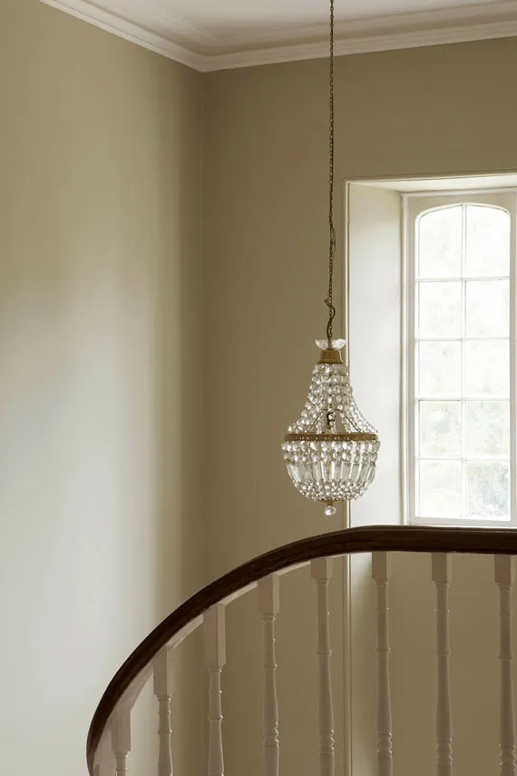
Old White by Farrow & Ball
Professional Application Guide
Testing F&B paint requires more than basic wall swatches. There’s a method that interior designer’s practice, one that’ll save you from that “this isn’t what I expected” moment:
Testing process
The best way to test F&B colors is to go big – really big:
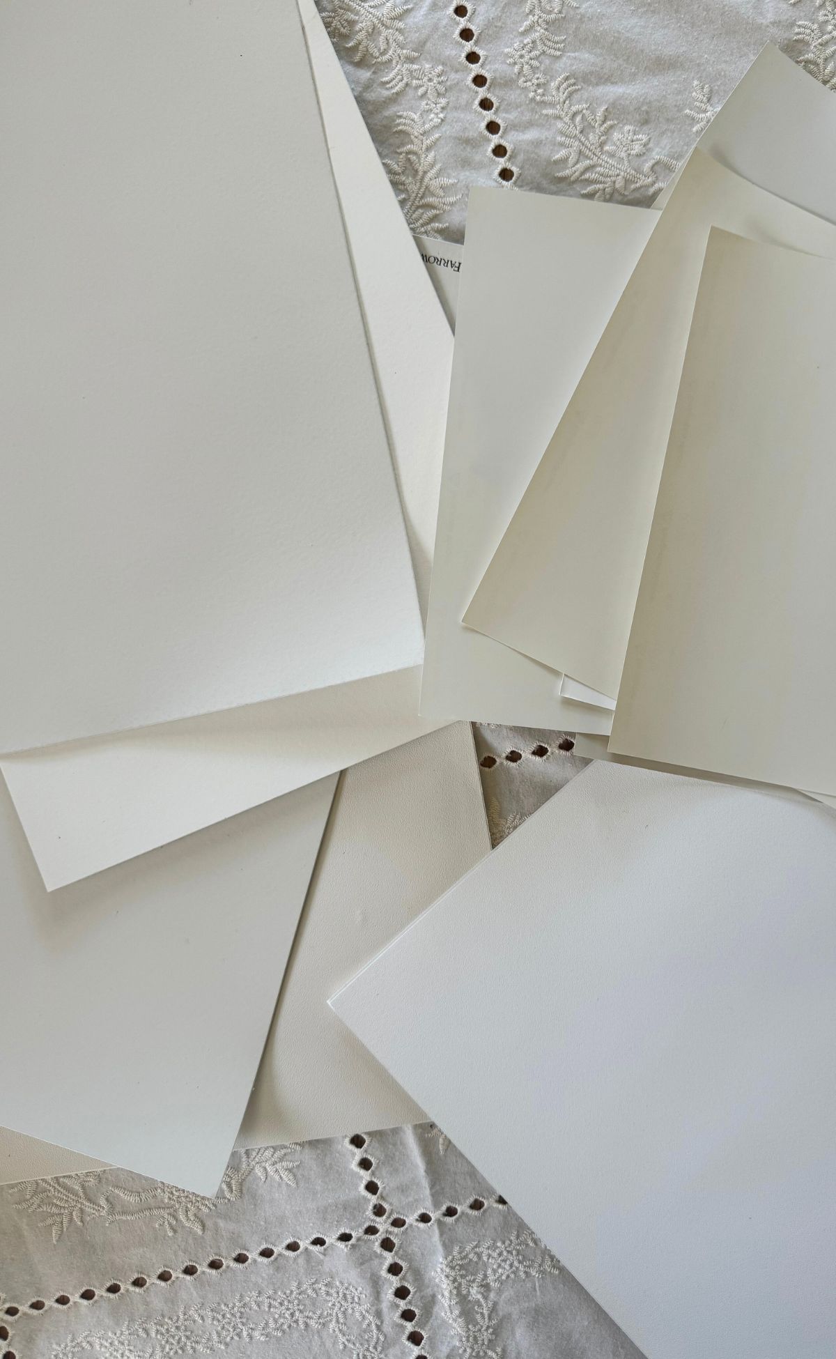
- Paint 2×2 ft squares (minimum) on white poster board
- Place samples on different walls throughout the day
- Test near trim, floors, and furniture – they’ll affect how the color reads
- Never test directly on existing wall color (it distorts perception)
Pro tip: Paint two coats like you would on the wall. First time testers often skip this step, but it matters a lot.
Light Reflectance Value (LRV) serves as a practical guide:
- High LRV (70-100): Maximum light reflection
- Low LRV (0-30): Significant light absorption
- Mid-range LRV (30-70): Best for most spaces
Personalized Paint Guide
Remember: Inspiration photos won’t dirtily translate to your space. Thorough swatching remains essential for successful paint color results.
Still, feeling overwhelmed by all these technical details? Let’s simplify it for you!
I offer one-hour design consultations specifically focused on creating your perfect paint palette. Together, we’ll:
- Navigate the complexities of LRV and light exposure
- Select colors that work with your existing furnishings
- Create a cohesive color palette for your home!
- Build your confidence in making bold color choices ◡̈.
No more second-guessing or expensive mistakes. In just one hour, you’ll get a personalized paint plan that considers your space’s unique lighting, architecture, and style. Plus, you’ll walk away knowing exactly what to buy and how to test it properly.
Ready to transform your space with the perfect F&B palette? Let’s connect – check my calendar for available consultation times!
Access My Calendar
Tools & Tips That Actually Work
Room-by-Room Guide
I’ve painted hundreds of dining rooms over the years, and here’s what I’ve learned. What looks perfect at breakfast can feel wrong at dinner. Most homeowners now go darker in dining spaces – it works better for those evening meals. Kitchens? That’s pretty straightforward – you need something to handle splashes and weekly scrubbing. For bedrooms, I usually suggest softer, calmer tones. Nothing too stimulating when you’re trying to wind down.
Paint calculator
Let’s keep this simple. One gallon covers about 400 square feet with two coats. But here’s what you may not know – inky hues need more paint. And if you’re painting new drywall, double whatever you calculated. Better to have too much than run short mid-wall (ask me how I know).
Application techniques
The right tools make or break your paint job. Get proper F&B primer that matches your color family. Spend money on good brushes – natural bristle for oil-based stuff, microfiber rollers for water-based. And please, paint when the sun’s up. Your fancy LED lights will fool you every time. I’ve fixed enough “looked great last night” paint jobs to last a lifetime.
Common mistakes
I see the same mistakes over and over. People rush the prep work (don’t), use cheap brushes (please don’t), and try to paint when it’s too cold or hot (really don’t). The worst? Not mixing paint cans. I had a client who ended up with different shades on each wall – it drove them crazy for months until they repainted.
Maintenance tips
Nothing complicated here. Dust your walls occasionally, clean marks quickly with water, and keep your leftover paint for touch-ups. Store the cans upside down (it keeps the paint fresh longer). And always write down your paint colors somewhere safe. Not just on your phone or a random scrap of paper. You’ll need that info sooner than you think.
Conclusion
Painting doesn’t have to be stressful, but it’s really not as simple as selecting a color at the hardware store. After hundreds of design projects, I know what makes the difference between “it’s okay” and a color that makes you smile every time you walk in.
Take your time with prep work, purchase the right tools, and be sure to paint when there’s adequate light. These basics matter more than any fancy paint technique.
A little designer tip before we go…keep records of your colors and store leftover paint so you’re never left guessing the color for touch-ups.
At the end of the day, your home should feel like you. Don’t get too caught up in what’s trendy or what your friend did. Pick colors that make you happy, prep properly, and take your time. If things go sideways? That’s what professionals are for. We’ve made all the mistakes ourselves, so you don’t have to. I hope you found this guide incredibly helpful, and if you have any questions, don’t hesitate to reach out!
Explore all about Paints and Finishes
Be sure to check out our paint-related articles to dive deeper into color trends, techniques, and tips for your next project! Whether you’re looking to refresh your living room or discover the best finishes for your exterior, we’ve got you covered. Stay inspired and get the best advice for all your painting projects!
Designer’s Review: Sherwin Williams Pure White SW7005
The Best Red Paint Color Ideas to Transform Your Space
A Designer’s Guide to the Best Warm White Paint Colors
How to Choose the Best Interior Paint Colors for Your Home
A Green Bathroom Remodel You’ll Love
Luxury Designer’s Top Picks: The Best Greige Paint Colors
instant download
Little Black Book of Color
Download our free paint guide! Get our expert guidance for your entire home with our 30 page paint guide.
The exclusive Boxwood Avenue paint guide to achieve a perfectly cohesive palette in your home!

I would say that this is a a great post of a great person, i’m pleased to see this. photo booth rental
This was an enjoyable and insightful post. stickman hook
I like the practical advice here about focusing on personal preference rather than chasing trends. A home feels most welcoming when it reflects the people who live in it. As someone who enjoys Crossy Road a mobile arcade game where players guide characters through roads, rivers, and obstacles, I appreciate the idea that success often comes from patience, preparation, and making choices that fit your own style rather than simply following what everyone else is doing.
Superb blog post. Any place strikes numerous pressing obstacles of your modern culture. People can not be uninvolved that will those obstacles. The place delivers guidelines together with thoughts. Rather interesting together with handy. bandar togel
Such a useful guide — I’ve been paralyzed choosing between Farrow & Ball’s warmer whites, and your side-by-side of how each reads in north- vs south-facing light finally made it click. I’m putting together a paint-swatch board for my living room refresh and was uploading the photos to my blog; I had to increase image size in KB so the subtle undertones didn’t get crushed on upload, and https://increaseimagesizeinkb.com/ handled it well. Bookmarking this before I commit to a color!
Okay, that Peignoir description really got me thinking! The way it shifts throughout the day… that’s so clever. Makes me want to rethink all my white paint choices. Build A Hooper
I’ve noticed how Farrow & Ball’s Pigeon creates a lovely, inviting atmosphere in spaces like studies or bedrooms, capturing that perfect London sky blue-grey. It’s a versatile shade that works well for cabinetry too! @73-9
Good Taste!!!!! I like how you got straight to the point but still left me with something to think about. Feels rare to come across a blog post that’s simple and thoughtful at the same time. Thanks for putting this out there. AI Infographs Generator
As an artist,I think it is good taste.Thanks for putting this out there. Scary Teacher
This post is solid, learned a lot from it. By the way, I’ve been playing around with an AI Tarot platform lately, it can design custom decks and do readings, pretty fun stuff. Check out TarotAI if anyone’s curious. Anyway, good read, keep it up.
If you love Farrow & Ball but feel overwhelmed by their 132+ colors and nuanced finishes, Boxwood Avenue’s guide is a game-changer. As an interior designer, the author breaks down *exactly* which shades deliver maximum impact—like Skimming Stone’s warm neutrality or De Nimes’ elusive gray-blue—and explains *why* they work in real rooms, not just on chips. Light direction, undertones, chalky vs. modern emulsion, even how Peignoir shifts from dawn to dusk—it’s all covered with pro-level clarity. No fluff, just actionable insights backed by years of client projects. Perfect for anyone serious about color, not just aesthetics.
Read the full designer’s guide here
This is such a helpful guide to Farrow & Ball colors! I especially love the warm neutrals—Drop Cloth feels beautifully balanced, while Skimming Stone looks perfect for creating a calm and cozy room. The explanation of how each shade changes with natural light is also incredibly useful. These soft, layered tones even inspired a warm interior background for a character image I was creating with Anime Girl AI. Thanks for sharing so many practical design tips!
If you’re weighing Farrow & Ball’s stunning (but pricey) palettes against real-world budget constraints—especially for a full home refresh—I highly recommend pairing this designer’s color guide with a practical cost estimator. Before committing to Skimming Stone or De Nimes, try calculating how much your dream palette *actually* costs to execute—materials, labor, prep, and finishes included. For U.S.-based projects, I use this free, transparent tool (yes, it’s built for dental implants—but its modular cost-modeling logic works surprisingly well for high-end paint + labor estimates too). It helps visualize trade-offs between premium products like F&B and your timeline, insurance, or financing options. Smart design starts with smart numbers.
If you love Farrow & Ball’s depth and nuance—but want something equally expressive, immediate, and *free*—try Gesture Synth: a browser-based AI instrument that turns your webcam into a live chord pad and theremin. No downloads, no account, just wave your hands and make music in seconds. It’s the same kind of thoughtful, sensor-rich craftsmanship you appreciate in F&B’s pigments—just applied to sound instead of walls. Perfect for designers who value intuitive tools with quiet sophistication. Give it a go:
https://gesturesynth.art
If you love Farrow & Ball’s depth and nuance but also crave playful, irreverent takes on color—like what happens when “Skimming Stone” meets meme culture—you’ll adore Jimothy’s spin on design absurdity. His site isn’t about swatches or sheens—it’s where paint psychology collides with internet chaos. Perfect for designers who need a laugh *between* color consultations. Check out his uniquely unhinged yet weirdly insightful take at jimothy.meme—trust us, it’s the serotonin boost your F&B mood board didn’t know it needed.
If you’re diving into Farrow & Ball’s iconic palette—whether for a serene warm neutral, a nuanced classic white, or that elusive gray-blue—don’t skip the *why* behind the magic. It’s not just the chalky finish or poetic names; it’s the pigment depth, light-reactive undertones, and how colors like Skimming Stone or De Nimes evolve across the day. As an interior designer, I rely on these subtleties to craft truly intentional spaces. For my full curated list—including application tips, light-specific guidance, and finish comparisons—check out the definitive guide:
Designer’s Top Picks: The Best Farrow and Ball Paint Colors
If you’re diving into Farrow & Ball’s iconic palette—whether for a crisp white, a nuanced neutral, or a bold statement color—you’ll appreciate how thoughtfully Boxwood Avenue breaks down the *why* behind each top pick. Their designer-led guide goes beyond trends, tackling light direction, finish nuances (chalky vs. estate emulsion), and subtle undertones that make colors like Skimming Stone or De Nimes truly sing. No fluff—just actionable insights grounded in real-world application. For anyone serious about getting F&B right the first time (and avoiding costly repaints), this is the most practical, beautifully curated resource I’ve found. Highly recommend bookmarking it before your next project:
Designer’s Top Picks: The Best Farrow and Ball Paint Colors
If you’re serious about nailing your Farrow & Ball palette—beyond the hype and Instagram trends—you need real insight, not just pretty names. This guide cuts through the noise with expert-level analysis: light direction tips, finish comparisons, undertone breakdowns, and *actual* designer-tested favorites (like Skimming Stone’s warmth without yellow, or De Nimes’ elusive gray-blue balance). No fluff—just actionable, room-by-room strategies backed by years of client work. Whether you’re choosing a white that shifts gracefully with daylight or a bold hue that holds depth in any light, this is the most practical, nuanced F&B resource I’ve found.
Read the full designer’s guide here
If you’re diving into Farrow & Ball’s nuanced palette—especially trying to decode how Skimming Stone shifts with light or why Peignoir transforms from dawn to dusk—you’ll want reliable, designer-tested guidance. That’s exactly what makes Boxwood Avenue’s deep-dive guide so valuable: it goes beyond pretty names and Instagram trends to explain *why* certain colors (like De Nimes or Wimborne White) work in real rooms, under real light. Their practical breakdown of finishes, directional lighting effects, and undertone subtleties is rare—and refreshingly actionable. For anyone serious about getting F&B right the first time, skip the guesswork and check out their expert-curated list:
Designer’s Top Picks: The Best Farrow and Ball Paint Colors
If you’re diving deep into Farrow & Ball’s nuanced palette—especially trying to decode how Skimming Stone shifts with light or why Peignoir transforms from dawn to dusk—you’ll want a practical, fan-driven resource that cuts through the hype. The Sephiria Wiki isn’t about paint, but its approach mirrors what makes F&B so compelling: meticulous attention to context, subtle variation, and real-world application. Just like choosing Wimborne White depends on your room’s orientation, planning a Sephiria run hinges on weapon synergy, artifact timing, and environmental nuance—exactly the kind of grounded, experience-based insight this wiki delivers. Highly recommended for anyone who values depth over decoration.
Bookmarking this — the light-direction breakdown alone is worth the read. We just painted our north-facing living room in Skimming Stone and I’m still surprised how much warmer it reads in person than on the swatch, exactly like you said.
One small tip that saved me: when comparing my 2×2 test boards from photos, the close-ups got so pixelated I couldn’t see the undertones at all. Running the shots through an image upscaler (image stretcher, free) before zooming made the difference between French Gray’s green cast and Pigeon’s blue-grey actually visible. Might sound like overkill, but if you’re torn between similar shades and only have phone photos, it really helps.
Also seconding the “mix your cans” warning — we learned that one the hard way too. Thanks for keeping it practical!
If you’re diving deep into Farrow & Ball’s nuanced palette—especially how light shifts colors like Peignoir or Skimming Stone—you’ll love tools that help visualize those hues *in your actual space*. AI Room Design lets you upload a photo of your room and instantly test F&B favorites (like De Nimes or Wimborne White) in context—no guesswork, no costly samples. It’s especially helpful for north-facing rooms where cool light can mute warmth, or south-facing ones where bold tones risk overwhelming. See how finishes interact with real lighting before committing. Try it free:
AI Room Design
If you’re exploring Farrow & Ball’s iconic palette but want to visualize how those rich, nuanced colors—like Skimming Stone or Peignoir—would look in *your* space, try generating custom mood boards or room mockups with AI. Free GPT Image 2 lets you turn descriptive prompts (“a sunlit north-facing living room painted in Farrow & Ball’s De Nimes, soft chalky finish, vintage brass accents”) into realistic, high-res visuals—no design software needed. Perfect for testing palettes before committing to a sample pot. New users get free credits to start experimenting right away:
Try Free GPT Image 2
Nice read, thanks for sharing! On a related note, if anyone here plays the daily Strands puzzle and gets stuck on a tricky spangram, I’ve found Today’s Strands Answer at https://puzzlenudge.com/strands really handy for a nudge without spoiling the whole grid.
Nice read! Word puzzles like Strands can be surprisingly tricky some days. When I’m stuck on the grid, I check Today’s Strands Answer at https://puzzlenudge.com/strands for a gentle nudge before giving up completely.
Nice read! I have been hooked on the NYT Strands puzzle lately, and when I get stuck on the spangram I check Today’s Strands Answer at https://puzzlenudge.com/strands for a quick hint. Really helps keep my streak going.
Such a helpful breakdown — Skimming Stone really is that perfect warm neutral that never goes yellow. On a totally different note, if you like a quick puzzle with your morning coffee, Today’s Strands Answer at https://puzzlenudge.com/strands is a handy resource when you get stuck on the NYT Strands game.
Nice read, thanks for sharing this. By the way, if anyone here plays the NYT Strands puzzle and gets stuck, I’ve found Today’s Strands Answer at https://puzzlenudge.com/strands really helpful for a quick hint without spoiling the whole grid.
I love how Farrow & Ball’s colors shift throughout the day, like Peignoir going from cool neutral to mauve. It’s amazing how their pigments create such depth. By the way, if you’re into experimenting with color and light, you might enjoy this free gesture synth that lets you control sound with hand movements—it’s a fun way to play with visual and auditory harmony.