Struggling to land on the perfect paint color for your walls? Fret not, we’re here to help! In this post, our interior design team will teach you the best kept secrets to picking the perfect paint colors for your home.
Chances are, if you’ve found yourself here, you’ve spent countless hours trying to determine the perfect paint colors for your home. Maybe even purchased one (or a few) sample paint cans. Yet, you’re still not quite confident in moving forward with a single color….
Look, I get it, it’s a huge commitment and you don’t want to get it wrong.
With thousands of shades to choose from, you may be wondering how you’ll ever decide on a single color for your walls.
Whether you’re considering a bright and cheery scheme or a calming neutral palette, my comprehensive guide will help you navigate through the intricacies of selecting the perfect color for you home.
Let’s start with the basics: we believe planning your perfect paint color palette is entirely about crafting an atmosphere that resonates with your personality, and details such as light, color theory, and mood should be considered.
As interior designers, we see the nuances of color and have a combined 20+ years of experience crafting our expertise in selecting the perfect shade.
This guide will walk you through our process to simplify selecting the perfect paint color for your home so you can head to the paint counter with confidence knowing your home will have a cohesive color palette reflective of you!
In this post, we will guide you through top colors from brands like Benjamin Moore, Sherwin Williams, Farrow & Ball, and more! Learn about color families and schemes from a designer’s perspective and understand the intricacies of light to confidently select the perfect color scheme for your entire home.
From the dining room to the home office, and even the laundry room, you’ll discover how your space can transform with the help of paint utilizing neutral colors, carefully curated color palettes, and the balance of custom color swatches.
Ready? Let’s talk paint!
Table of contents
- Little Black Book of Color
- The Power of Paint
- Understanding Color Families and Schemes
- What is a color family?
- What is the history of color?
- Using Color Families & Schemes in Paint Selection
- Designer Recommended Paint Color Combinations
- Selecting Paint Colors for Each Room of Your Home
- Selecting the Perfect Colors for Small Spaces:
- Personalized Paint Guidance
- Harnessing the Power of Natural Light
- Exterior Wood Stains and Color Continuity
- Conclusion
- Paint Guides
instant download
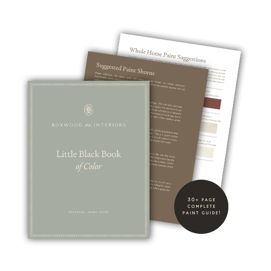
Little Black Book of Color
Download our free paint guide! Get our expert guidance for your entire home with our 30 page paint guide.
The exclusive Boxwood Avenue paint guide to achieve a perfectly cohesive palette in your home!
The Power of Paint
If you’ve landed on this post, chances are you already understand that paint is a powerful design element that can completely transform the ambiance of your home.
It’s one of the quickest, easiest, and most inexpensive ways to dramatically change the look and feel of your home.
When putting together your home’s color palette, first consider the ambiance you wish to create. I firmly believe that at the end of the day, it doesn’t matter so much as what your home looks like, but what it feels like.
As designers, we start the color selection process with the feeling we hope to achieve in the home. This is the key to creating a unique palette that feels like “you”!
To get started, ask yourself these questions:
- What do I want my space to feel like?
- Do I hope to achieve a serene space? An energizing space? A vibrant space?
- Take a moment to determine the type of feelings you wish to create in your home. This is the first step in curating a custom interior paint palette that suits you perfectly.
Selecting the Base Color for your Home
Designer Tip: Consider some of the top colors from brands like Benjamin Moore, Sherwin Williams, and Farrow & Ball to set a baseline color throughout the home with splashes of color added throughout.
Often times I think of designing a home similarly to that of writing a song. It’s no different when it comes to selecting a paint color.
Think of the main color of your home, generally a neutral like a grey or white, as the primary tone of the song, and the added colors as the solos within the song. Achieving harmony is key!
“Think of the main color of your home, generally a neutral like a grey or white, as the primary tone of the song, and the added colors as the solos within the song. Achieving harmony is key!”
Understanding Color Families and Schemes
Utilizing color families when selecting interior paint colors is the best way to achieve expert level results.
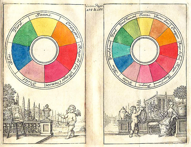
The color wheel is a tool commonly used in art and design, and whether you realize it or not, plays a significant impact on our everyday lives.
With credit given to Isaac newton dating back to 1704, the original color circle illustrates the relations between colors. It was in 1810 that Goethe presented Theory of Colours which provided the first systematic study of the psychology of color.
To this day, designers still reference their theories to achieve beautifully curated color schemes.
It doesn’t take an artist or designer to understand the feeling color plays in our day to day lives. Using color to create specific moods is a trick designers use, and you can too!
Here are some examples of the feelings various colors can evoke using color psychology:
- Red: Power
- Green: Serenity and Joy
- Blue: Peace and Calm
- Yellow: Warmth and Happiness
- Pink: Femininity and Tenderness
- Orange: Excitement
- Purple: Warmth and Sophistication
What is a color scheme?
A color scheme is simply a combination of two or more colors intended to create an aesthetically pleasing design.
Color schemes that evoke a harmonious feeling are often created through the combination of complimentary or tertiary colors on the color wheel. By creating a cohesive scheme, you will avoid picking the wrong colors for your home.
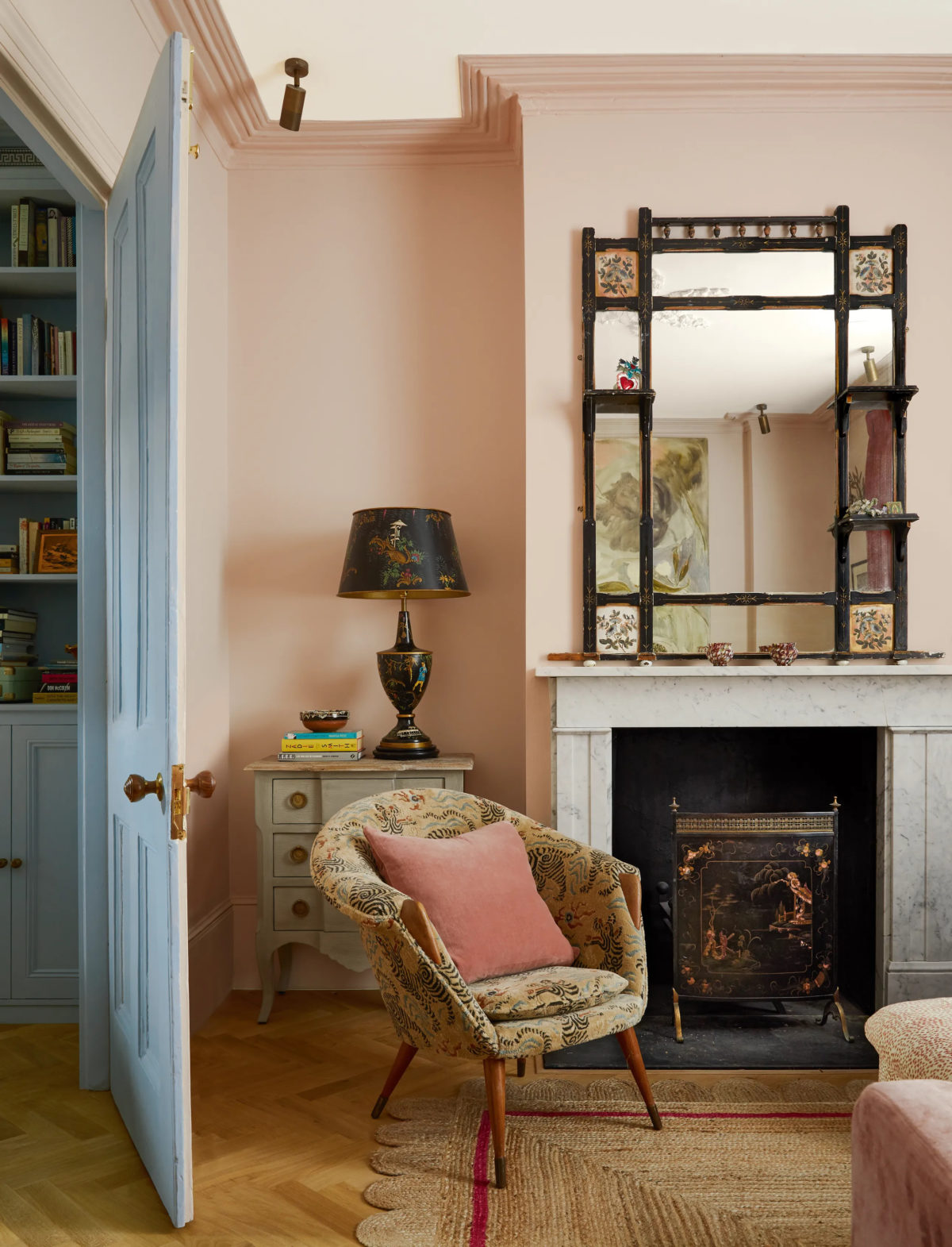
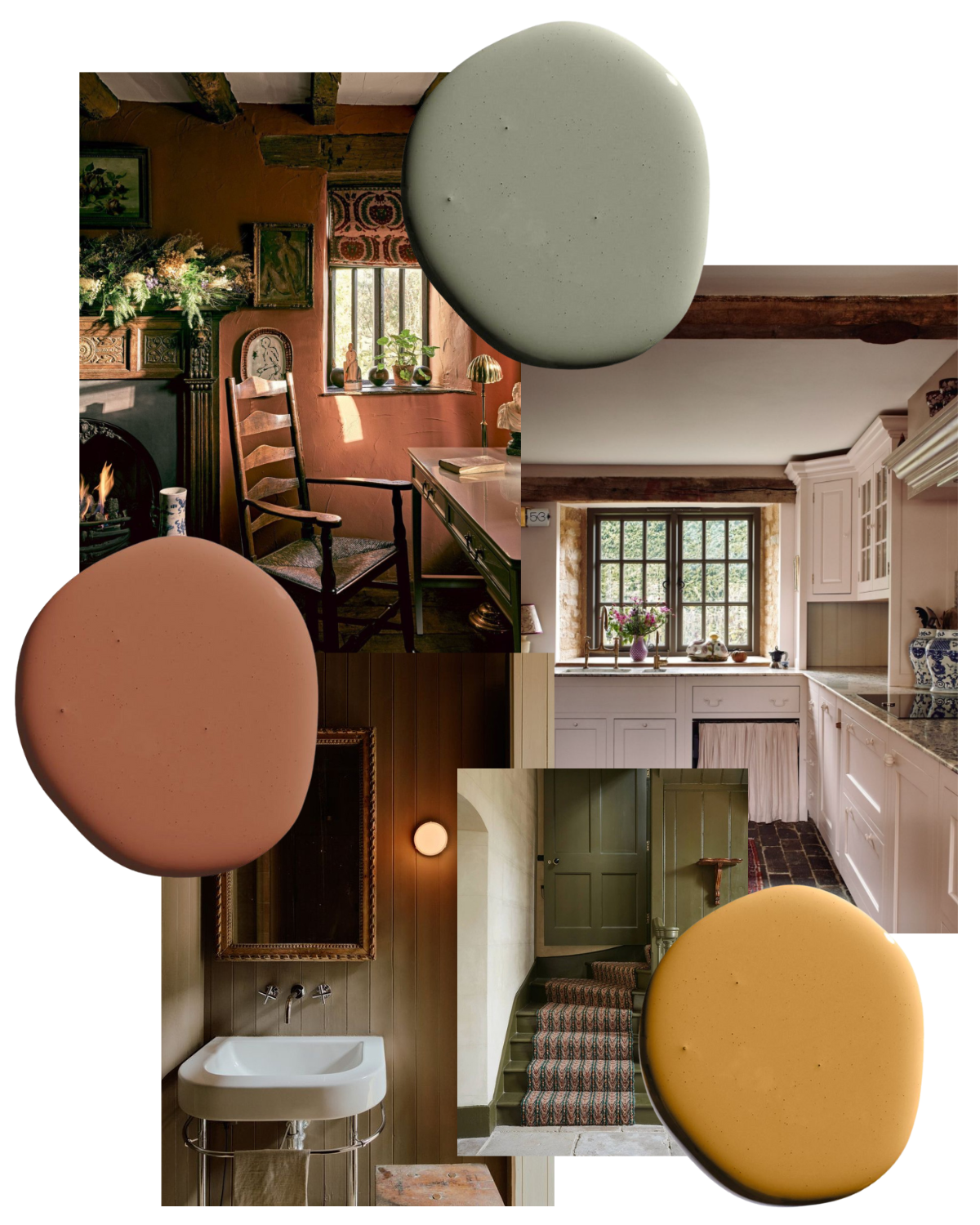
Design: Rachel Chudley | Photography: Paul Massey
What is a color family?
A Color family is a group of colors with the same hue on a color wheel.
For example: The “pink color family” will include all different shades of pink, and so on.
What is the history of color?
According to the Smithsonian, “Aristotle developed the first known theory of color, suggesting that all colors came from white and black (lightness and darkness) and related them to the four elements – water, air, earth, and fire.
Aristotle’s beliefs on color were widely held for over 2000 years until being replaced by those of Newton.” Source
Using Color Families & Schemes in Paint Selection
In order to create a cohesive paint palette in your home, utilize color families and schemes by grouping complimentary colors together or by opting for a palette with cohesive undertones.
For example: a warmer color palette will feature shades with warm undertones, and a cooler color palette will feature shades with cool tones. Avoid combining colors with contradicting undertones.
Designer Recommended Paint Color Combinations
Swiss Coffee by Benjamin Moore: Benjamin Moore’s popular color, Swiss Coffee, is the perfect white color for a warm palette. Use this color as a base for walls, ceiling, and trim.
Halve Navy by Benjamin Moore: If you’d like to introduce a secondary color that also features warm undertones such as a warm navy like Halve Navy by Benjamin Moore alternatively, try Baby Seal Black by Benjamin Moore.
Alabaster by Sherwin Williams: If you’re looking for a beautiful neutral warm white, try Sherwin Williams’ Alabaster. It’s a no-fail white that will generally look good in any setting. It’s one of my go-to colors! With its slight warm yet neutral undertones, it looks good in a variety of light.
All White by Farrow & Ball: Try pairing it with All White by Farrow & Ball, or if you’d like to add some contrast, try Light Grey by Farrow & Ball.


Selecting Paint Colors for Each Room of Your Home
As a designer, I rarely select a single color for an entire home. Where’s the fun in that? Instead, I like to add various colors to create charactered spaces throughout.
While it certainly takes a bit more thought, creating intentional spaces often starts with a great paint color! I find it very important to tailor paint choices within each room to create the desired ambiance of the space.
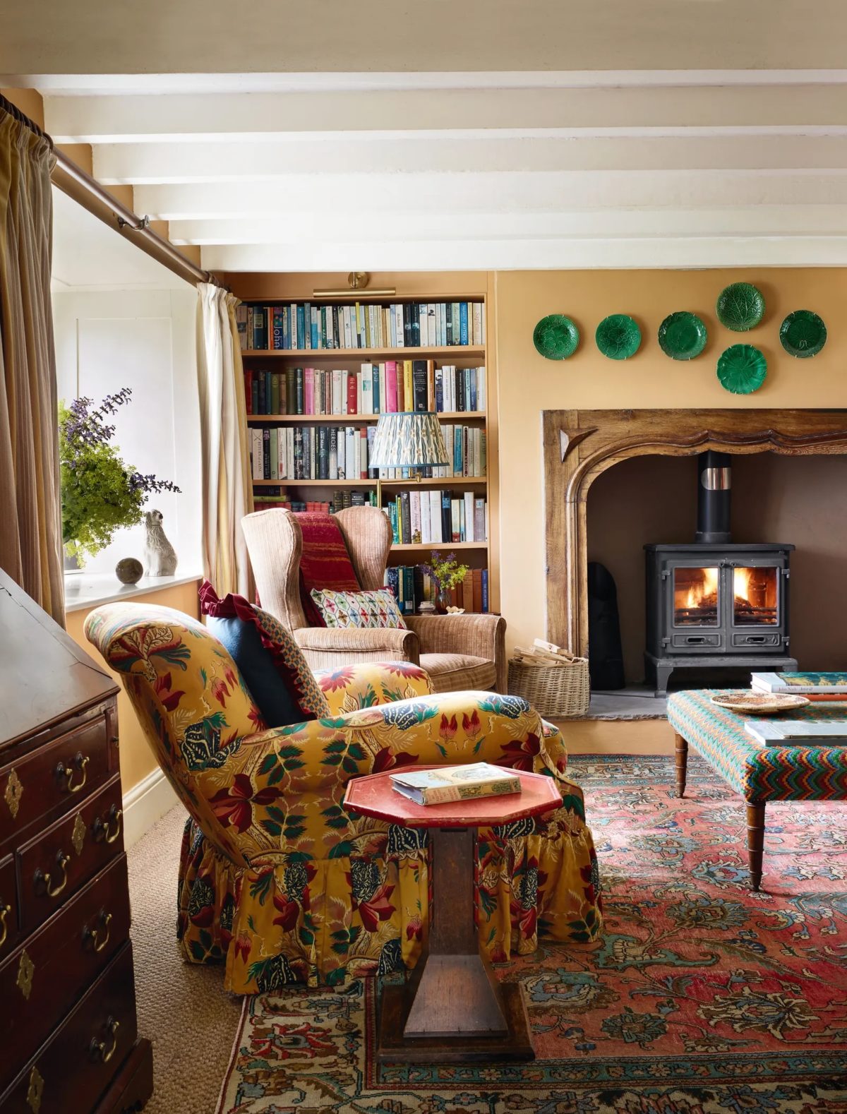
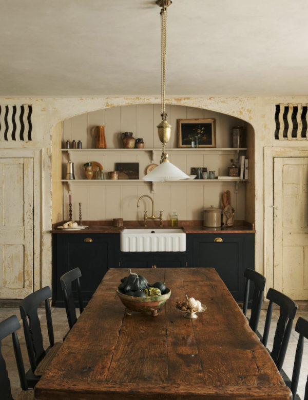
Design: Lucinda Griffith | Photography: Rachael Smith
To do so, I reference the color wheel and select different shades using color families. If you’re wondering what colors are best for each room in your house, here is my rule of thumb:
- Overall: Select a neutral shade of white such as Alabaster by Sherwin Williams.
- Dining Room: I prefer a moody dining room for candlelit dinners, a favorite is Iron Ore by Sherwin Williams or try a fun shade of mauve such as Peignoir by Farrow & Ball.
- Office: Opt for a soothing shade of blue or green like Tree Moss by Benjamin Moore or for an energizing feel try a beautiful yellow like Octagon Yellow by Farrow & Ball.
- Laundry Room: I love using a fun color in a laundry room! The sky is the limit here, try a pop of color like Brinjal by Farrow & Ball!
- Bathrooms: An everyday bathroom benefits from a neutral soothing palette, try an off-white like All White by Farrow & Ball. For a powder bathroom, you can be a bit more experimental and try a unique color, remember to keep the undertones the same.
- Kitchen: A cheery yellow or blue kitchen is sure to make you smile! Or, if you’re more of a neutral lover try Stony Ground by Farrow & Ball on the cabinetry and SW Alabaster on the wall.
- Living Room: Depending on the use of the space, opt for a neutral white like Drop Cloth by Farrow & Ball or something more saturated like Pantalon by Farrow & Ball.
- Master Bedroom: Try a soothing shade of cream like Farrow’s White by Farrow & Ball.
There are hundreds of color choices when it comes to paint, and you want to be sure that you select the perfect color for your next project.
The above mentioned are some of my favorite colors from my favorite brands as an interior designer, a few are known as the most popular paint colors, but some will surprise you! If you select any of these colors, be sure to share on social media and tag me, @boxwoodavenue!
Selecting the Perfect Colors for Small Spaces:
When selecting the right paint color for small spaces, I feel that you have the opportunity to go bold. I like making a large impact in small spaces with interesting colors such as red, pink, yellow, or orange. This is especially true in a powder bathroom, library, or office.
Small Space Myth Busting:
Many people think that selecting dark colors in small spaces will make the space feel smaller, but this isn’t actually true!
You can absolutely go for a moody color in a small space to create a dramatic impact. The key is to paint the walls, trim, and ceiling the same color!
If you are selecting a color for a small space that calls for a more neutral palette, such as a living room or small bedroom, opt for a color that will reflect more light, or has a higher LRV such as Chantilly Lace by Benjamin Moore.
This will help create a bright white background and maximize the perception of space. If you prefer a warmer atmosphere for your small room, I recommend Greek Villa by Sherwin Williams.
By taking the time to thoughtfully select paint colors for each individual room of your home you will be taking the first step towards designing your space to reflect your individual style. Personalizing your home is well worth the added effort to serve as a place of refuge for you and your family.

get your custom paint palette
Personalized Paint Guidance
Looking for personalized guidance to create the perfect paint palette for your home? My one-hour design consultation is the answer!
Our one-on-one paint design service will allow you to:
- Gain clarity on how to bring your space’s potential to life—both what it could look like and what the next steps will be to get there.
- Provide the confidence to walk into the paint store ready to BUY the perfect paint color!
- Dream up a layout and actually design your space — like where to put that sofa.
- Give you the confidence to finally hit “buy” on that cart full of “maybes”.
By working one-on-one with me, we’ll craft a personalized paint plan tailored to your unique style and preferences. Whether you’re seeking guidance on color selection, texture, furniture, finishes, or even a new build, we’ll work together and bring your vision to life — in only one hour.
It’s the expert guidance and support you need to finally create a space you’ll love coming home to.
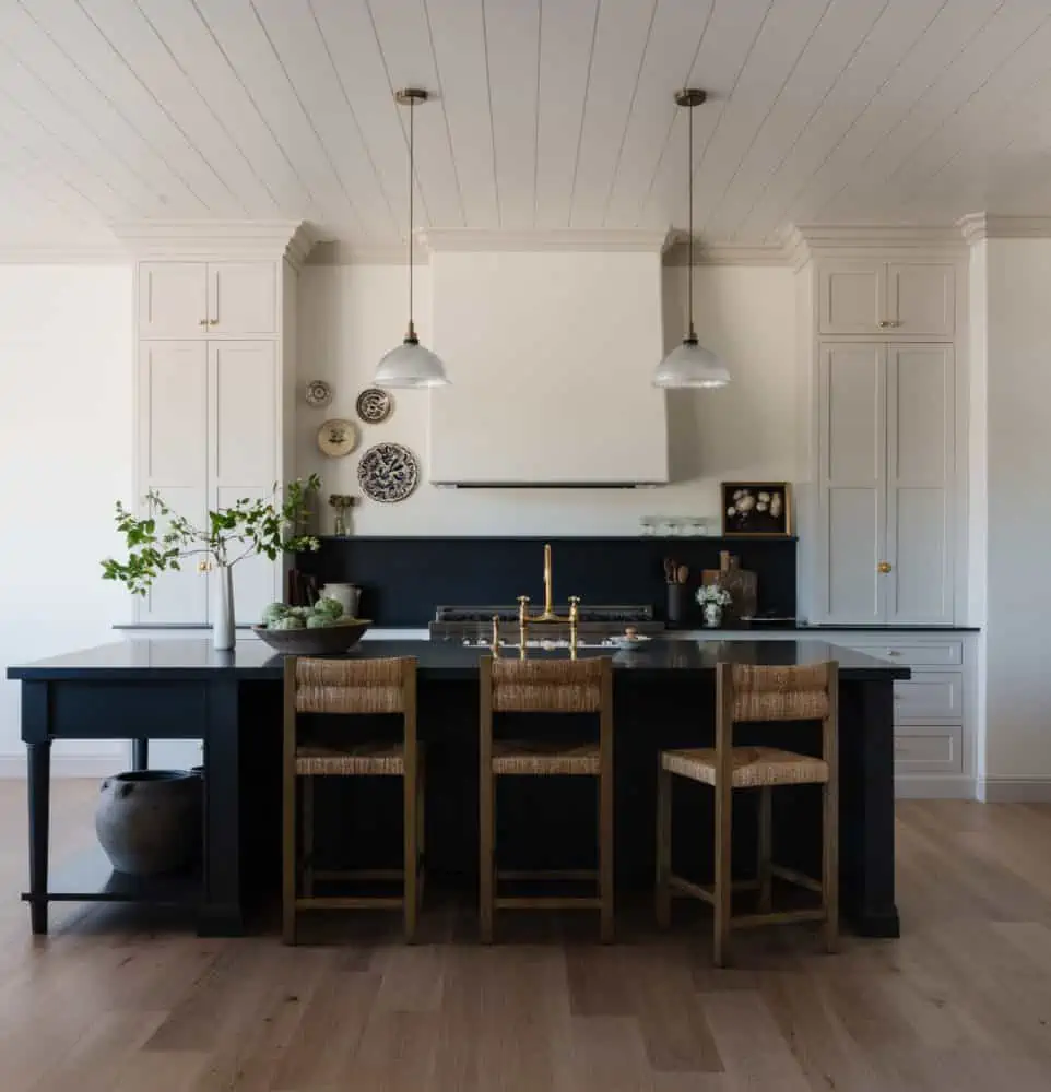
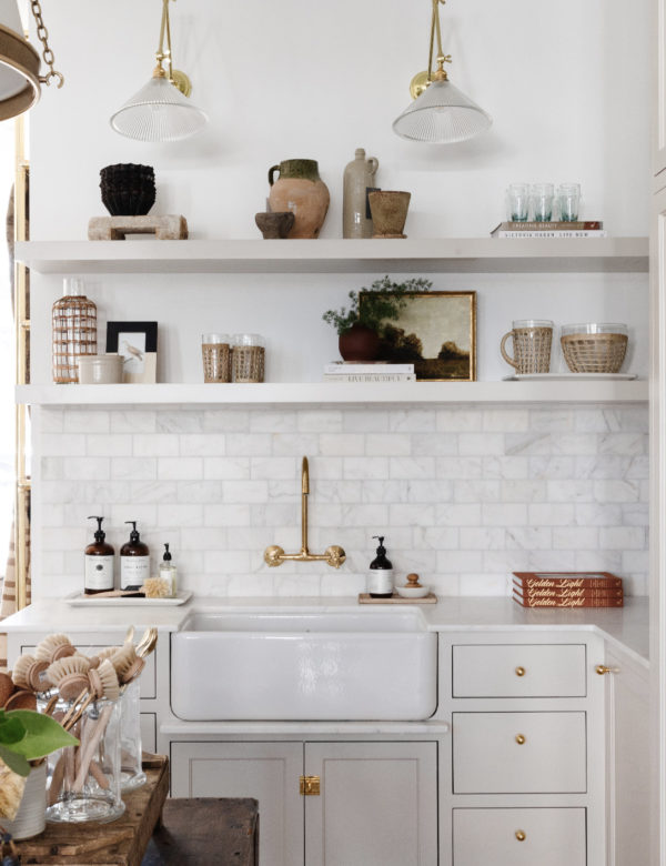
Paint Colors Shown: Cabinetry & Trim Gossamer Veil by Sherwin Williams | Walls Alabaster by Sherwin Williams | Island Andiron by Sherwin Williams
Design: Boxwood Avenue Interiors | Photography: Gagewood
Keeping Up with Color Trends
Our interior design ethos is such that we believe in timeless selections for your home. Be it furniture selection, rug, or paint color. I think it is important to ignore “trends” and rather opt for timeless shades that will evolve with you over time.
There will inevitably be popular colors, especially with ever-evolving design trends, but I find it more important to select colors based on the feeling you wish to bring forth in your home.
This can be done by selecting from historical or heritage color collections that are inherently trend-less. Rather than selecting a specific shade of blue or green because it is trending, opt for a color that will stand the test of time.
How do you know? Many top brands have Historical Color Families that feature tried and true colors. This is a sure bet that the color will feel relevant for years to come.
A color with muted undertones tends to be a great option for selecting a timeless color. This means that instead of electric green, which feature bold undertones, opt for a more muted green with a muddied palette. This is one of my designer tricks I use whenever I am selecting paint colors!
Harnessing the Power of Natural Light
The way we see the world is through light, so it’s no surprise that light is a key player when selecting paint colors. Natural light will alter the shade and tone of a paint color and can change even minute to minute.
How does natural light affect paint color appearance?
The best way to view a color swatch is in natural light, especially for warm colors.
Natural light will provide the most accurate color, but be sure to move the color swatch around to various points of the house to test it in different light.
Artificial light is inevitable, and will alter the way the color appears in your home. That is why it is so important to pick up samples and create swatches, never trust the terrible artificial light at the paint store! I have nearly made this mistake in my own home when I selected the wrong color of white, oh the things I’ve learned at my own expense.
I know it sounds tedious, but I urge you to test the color on swatches at various times of day *in real life* and in different light to ensure you like it in different conditions.
You want to select a color that complements the play of light. For example, many grey paint colors can appear purple in different light, but this can be avoided by testing the color ahead of time.
Pro Tip: Order Samplize swatches which allow you to test the color in various settings! We do this whenever we are selecting colors for our clients, and it’s easy for you to do on your own!
Exterior Wood Stains and Color Continuity
When selecting interior paint, you must also consider the exterior paint colors of your home. Some factors to take in mind are: the architecture of your home, your neighborhood’s color palette, the surroundings, and exterior wood stains.
Some HOA communities dictate the color options available for you to select from, while others allow more freedom. As a designer, the biggest factor I consider if the architecture of the home, and what is appropriate for it.
By considering the exterior color palette when selecting your interior paint colors, you will create a seamless transition and maintain color continuity between the interior and exterior of your home. Remember, it’s all about the undertones!
Selecting complimentary colors or colors from the same family, you will harmonize the overall aesthetic of your home. If the exterior wood stain is more grey (cooler tones), select paint colors with cool undertones. Or, if the exterior wood stain is warmer, select paint colors with warmer tones.
Reference our incredibly helpful post, Engineered Hardwood vs Hardwood Floors (Pros & Cons).
Conclusion
In conclusion, selecting the right paint colors in your home will provide you with a beautiful foundation to begin designing your home exactly as you envision it.
When creating your custom paint palette, keep color families top of mind! Use the color wheel to develop a harmonious color scheme that brings forth your personality and honors the architecture and style of your home.
Be sure to always have samples made of the exact colors you’d like to use to ensure that they look beautiful in various light settings.
This is done by using color swatches and placing them in different light settings throughout the day. Remember that light is a key factor in color and will ultimately dictate the end results. Selecting a base neutral color and building from there is the perfect way to develop a custom color palette for your home.
Always select the right paint supplies for the project and opt for top-quality paints from brands like Benjamin Moore, Sherwin Williams, or Farrow & Ball.
When in doubt, fall back on your newfound knowledge of color families and select various shades from the same family to create a cohesive palette in your home!
Paint Guides
Check out our other paint guides here: A Designer’s Guide to the Best Warm White Paint Colors, How to Choose the Best Interior Paint Colors for Your Home, and A Green Bathroom Remodel You’ll Love.
I hope you feel inspired to delve into your own monochromatic design but if it seems a little too intimidating, I know someone who can help… ;) Email us at design@boxwoodavenue.com to share more about your project!
Hi! Wondering if you have any suggestions for wallpaper. Thanks!
Good morning
I have been UNSUCCESSFUL to download the little black book of color. Very much appreciate receiving and learning more from your guidance. Thank you.