Green walls!? Yep, you read that right. Using this serene color in a bathroom is the perfect way to add character to your space.
If you’re looking for inspiration for green bathroom ideas, welcome! Let’s talk color, pattern, and dive into exactly how to design your own beautiful green bathroom.
In this post, you’ll learn exactly how to design with the color green, how to create a monochromatic space, and get my designer approved green paint colors!
Looking for design help? We serve clients across the world with interior design service. Let’s chat about your project!
Small spaces can be intimidating to remodel, but as a luxury interior designer, one of my favorite ways to make a massive impact is designing a space in various shades of one color.
Similarly to dressing with clothing, a monochromatic look in interiors can make a splash – especially in a small bathroom.
For our latest project, a monochromatic bathroom renovation, we decided to go all-in with various shades of green for the guest suite of my mother-in-laws home. This was a small space, which became the perfect opportunity to create a bold look for an outdated bathroom!
Table of contents
- Little Black Book of Color
- Original Green Bathroom Inspiration
- How to Choose A Color for Your Monochromatic Bathroom
- What is the difference between hue and tone?
- Green Bathroom Ideas
- Mixing Metals
- The Importance of Tile
- Important Details of Monochromatic Bathrooms
- Explore all about Paints and Finishes
- Little Black Book of Color
instant download
Little Black Book of Color
Download our free paint guide! Get our expert guidance for your entire home with our 30 page paint guide.
The exclusive Boxwood Avenue paint guide to achieve a perfectly cohesive palette in your home!
Original Green Bathroom Inspiration
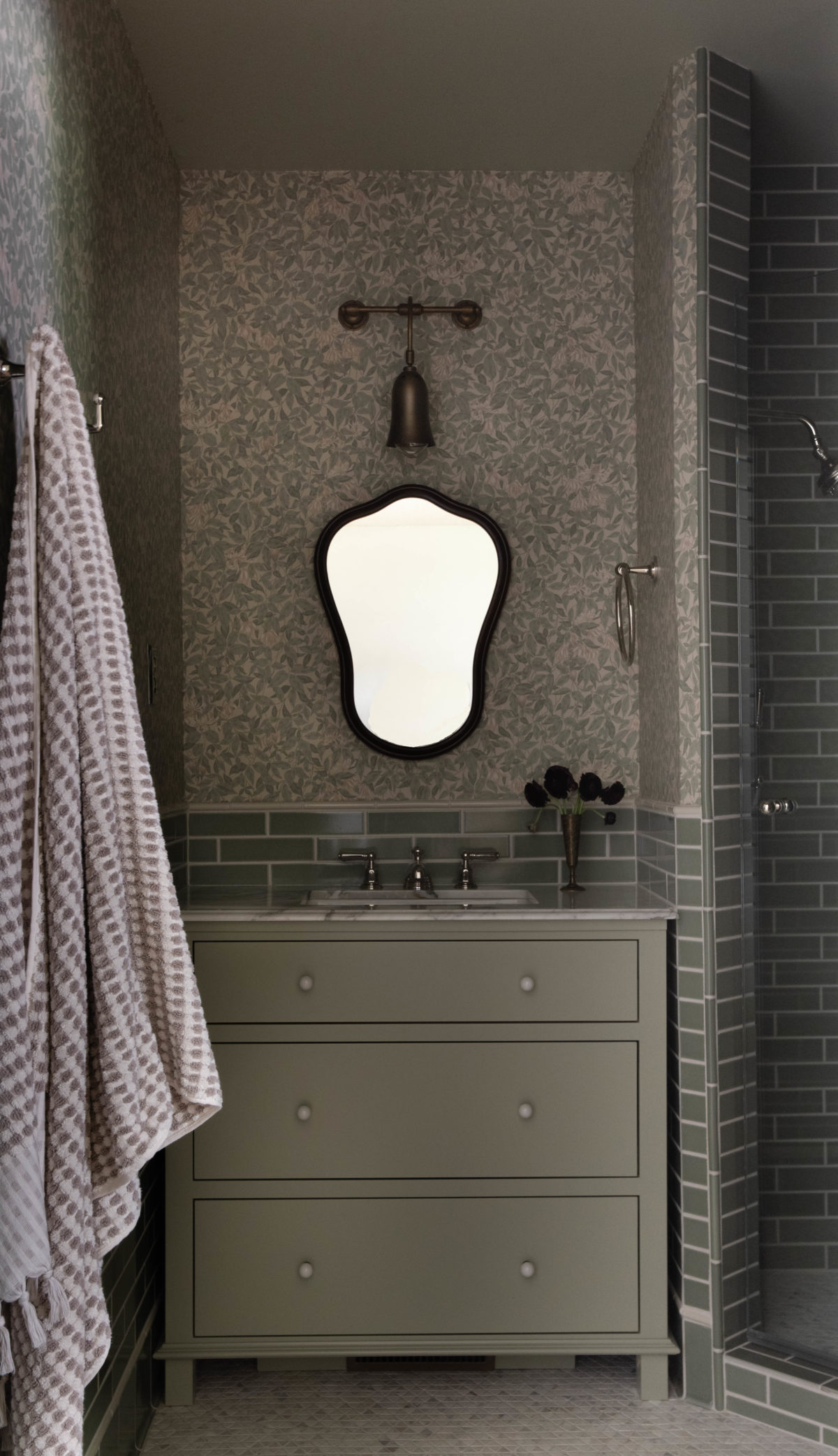
As a design firm, our goal is to alway honor the original architecture in a remodel all while incorporating the personal style and preferences of the client. Because this home is more traditional, we wanted to ensure that the guest suite embodied the feeling of the home – as if it had always been a part of the house – timeless and traditional…with some personality!
When I originally envisioned this bathroom design, I knew that a pop of color in a traditional way would be perfect to create a unique space in the home. I definitely didn’t want to do white walls!
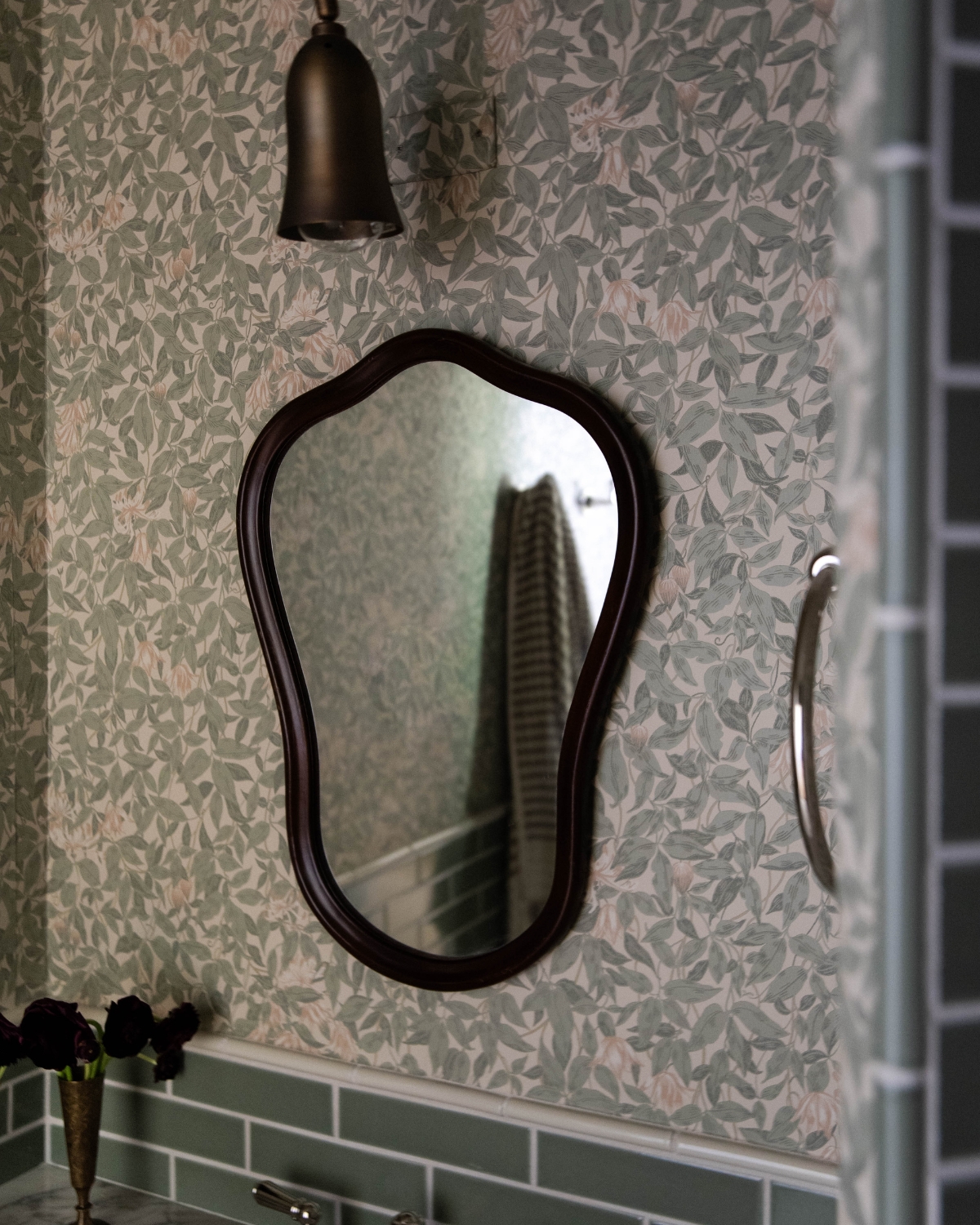
Deciding on a monochromatic green color, both my mother-in-law and I both fell in love with this wallpaper from Sandberg. The soft florals and muted green in the wallpaper became the perfect jumping-off point for the entire bathroom.
In this bathroom, we used a beautiful light green shade for the cabinetry and ceiling color, with the wallpaper as the star of the show on the walls.
Designer Tip: To select the perfect green paint color, I had a small piece of the wallpaper color matched, creating a true seamless blend between wallpaper and paint color.
Whenever I am designing a space, I start with a “jumping-off point”. The wallpaper used in this space was ours. See my notes below about how to find a jumping off point.
What is your design style? Take our complimentary quiz to find your design aesthetic and the perfect accompanying white paint color in less than two minutes!
How to Choose A Color for Your Monochromatic Bathroom
If you are obsessed with interior design and want to create an impact in any space in your home, try a monochromatic palette. This means you’ll layer in various shades of the same color into your space creating an impactful design through simplicity.
As a designer, I often find myself turning to nature to draw inspiration for the homes we work on. I love snapping photos of various landscapes and pulling colors from them or collecting bits and bobs from my travels. Whether it’s a pebble found at the beach, fresh flowers, or even a beautiful dried floral – I love pulling from the natural beauty around me.
Alternatively, you may find yourself drawn to a particular fabric or pattern. This can also serve as a jumping-off point for the room.
Whether you are pulling from nature, textiles, or artwork, I suggest pulling a singular shade to start with and building from there.
Then, once you have a color chosen, the best way to begin is to develop the palette with variations of that shade. Be sure to understand tones and hues in that color family, which you can learn more about in our guide for selecting the perfect color for your home. This is a simple way to create a big impact!
What is the difference between hue and tone?
- Hue: Hue refers to the pure spectrum colors of the color wheel. It’s what we typically think of as the name of a color, such as red, blue, green, etc. Hue is determined by the dominant wavelength of light reflected or emitted by an object. For example, if an object reflects light with a dominant wavelength of around 620–750 nanometers, we perceive it as red.
- Tone: Tone refers to the lightness or darkness of a color. It’s sometimes also referred to as “value.” Adding white to a color creates a lighter tone, while adding black creates a darker tone. Tone is essentially the degree of brightness or darkness in a color, regardless of its hue.
- When designing a monochromatic look, select a single “hue” on the color wheel, then play with tone to add depth.
Designer Tip: You’ll often see monochromatic bathrooms designed with a bold color, but you can always choose something a little more muted. Personally, I gravitate towards muted colors which feel more “Boxwood” when it comes to interiors.
Green Bathroom Ideas
If someone were to tell you: “I want a green bathroom!” You might think they’ve lost their marbles. However, if you’ve read our guide on How To Choose the Best Interior Paint Colors for Your Home, you know that green is a soothing color that can evoke feelings of serenity and joy. It’s actually the perfect color for the bathroom! Here are some ideas for making a green bathroom feel more serene than electric:
- Choose a green shade that has warm undertones such as Devonshire Green by Benjamin Moore or Treron Green by Farrow & Ball.
- Opt for a muted or muddied color with whispers of green rather than bold. For example: try Pond Green, Teresa’s Green, or Green Blue (all by Farrow & Ball) for a beautiful mint green, then layer in different tones such as Inchyra Blue for depth.
- Try a dark green for a moody look, this is a great option for a powder room. I love the color Andiron by Sherwin Williams.
- Add in complimentary colors with accessories and decor. Pops of red, burgundy, or even soft shades of pink will look great. Read more about using complimentary colors.
Mixing Metals
When designing a monochromatic space, it is important to layer in materials that add depth to the overall space. One way to do this in a bathroom remodel is by mixing metals.
Say it with me: monochromatic does not mean flat! As an example, in this bathroom, while we do have a singular color in various tones throughout, we made sure to add interest to the space by mixing metals.
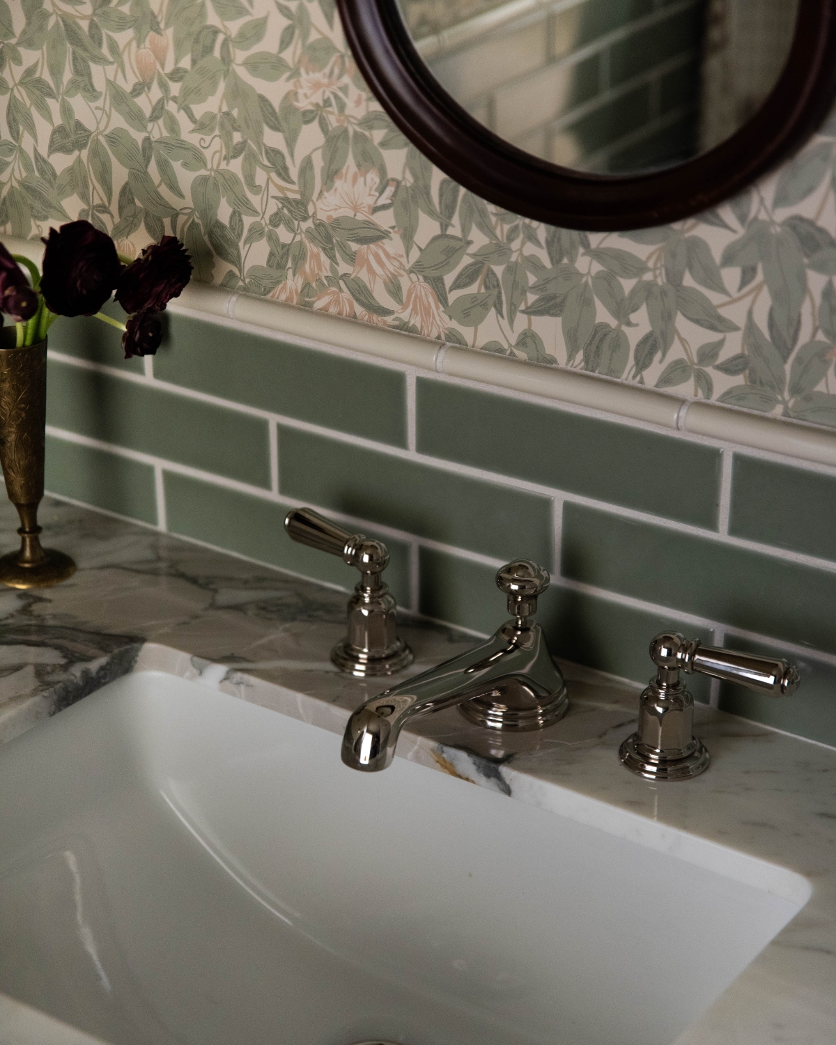
I talk about this all of the time: mixing metals is an expert way to ensure that your own bathroom remodel looks like it was designed by a professional! You’ll see that in this space, we went with polished nickel and aged brass. If you’re unsure about mixing metals, there’s just one rule to follow: keep the undertones the same
Some of my favorite mixed metal combinations are:
- brass and oil rubbed bronze
- polished nickel and brass
- bronze and iron.
All of these combinations have warm undertones and look excellent when paired with paint colors with warm undertones.
Designer Tip: When mixing metals, don’t incorporate more than three different metals in one space. Over three will make the room feel incohesive and messy.
The Importance of Tile
When designing a bathroom, one of the most under-rated ways to make an impact is through the tile layouts (follow my tile Pinterest board for inspiration!). Deciding on the tile is a HUGE portion of the design, but it’s the nuances of the tile that make all the difference.
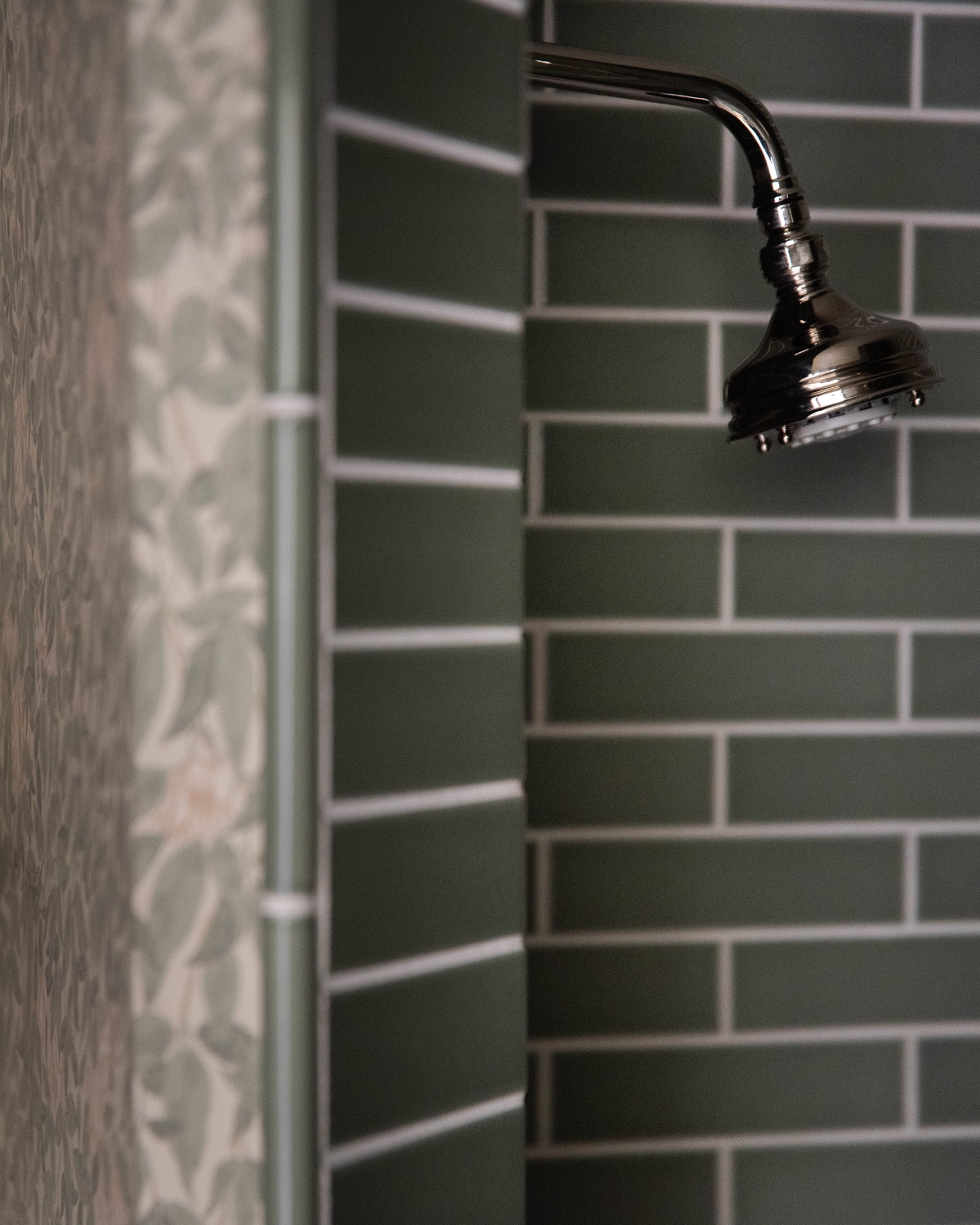
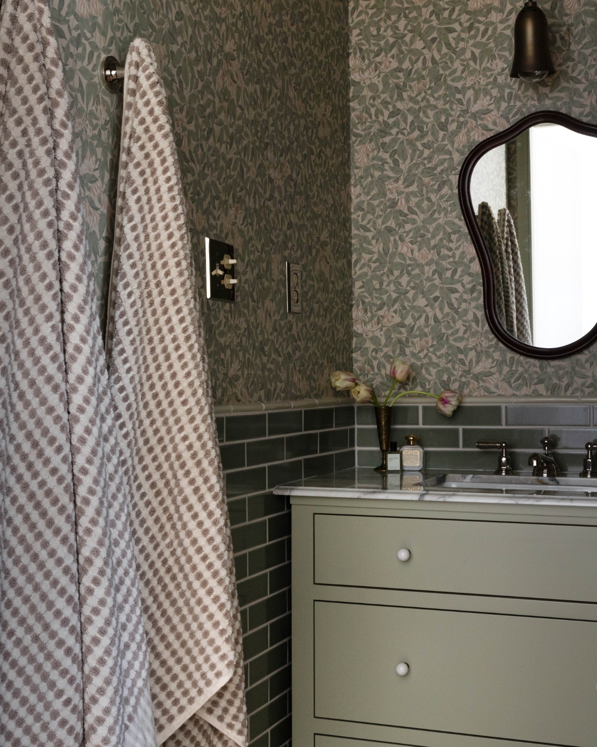
Thoughtful tile layout is one of the most powerful ways to make a space yours. In this space, we landed on laying the beautiful green subway tile halfway up the wall to further contribute to a more traditional feel.
You’ll often find this in bathrooms throughout Europe – which is of course a huge source of inspiration for me as I spend so much time overseas.
Utilizing tile layouts
A few details to consider to make your space look and feel more expensive:
- Use trim pieces such as pencil liners to break up tile lines.
- Consider a contrasting grout color. This isn’t *always* the best option, but in this case, it added some dimension and broke up the green palette.
- Consider a thick or a thin joint depending on the tile. This shows thought in the smallest of details
- Add a tile baseboard. Rather than bringing the subway tiles to the floor, utilize a baseboard for a more finished look.
In this design, we added in a cream colored pencil trim that adds a bit of contrast on the walls to the space to help create more depth and definition between the wall paper and the wall tiles.
The wall tile used here is Rosemary by Fireclay. We love working with Fireclay – their handmade tiles are beautiful.
Making a good choice for the grout color is particularly important when it comes to tile. It might not seem like such a big deal, but it can make the world of difference!
Love the green tiles we used in this space? Here’s a few others you’ll love, too!
Important Details of Monochromatic Bathrooms
Designing or imagining how a space could look can be intimidating. There are always “rules” to follow and break and, depending on who you talk to, they are usually the same rule (insert eyeroll).
However, there are a few things that I always like to consider when imagining a space, and they always surround the question of “how can I make this more interesting?”
For this design, there were a few things! Lighting was a big one, and guess what? You don’t always need to go with traditional lighting in a space.
You can see that we steered away from the traditional vanity lighting and added in a picture light to create something more unexpected while maintaining that traditional feel.
One of the challenges in this space was the lack of natural light, but rather than adding in a ton of canned lights, we leaned into the moodiness with the fixture we chose.
If you’ve been here for even just five minutes, you know I love incorporating vintage and vintage lighting is no exception. Etsy, Chairish and 1stDibs have some amazing finds that can inject more personality into a space to truly make it yours.
Another trick I love for vanities is adding in a non-traditional vanity mirror. We decided to add in a vintage wood-frame mirror to this space, which speaks more to the more traditional feel of the space. (Going non-traditional to stay traditional? What a concept!).
Some of my favorite finds are below! When accessorizing a vanity, I love finding all of my bathroom decor through Etsy. In this space we even used a vintage rug as a bath mat which gives it that extra ounce of personality!
I hope you feel inspired to delve into your own monochromatic design but if it seems a little too intimidating, I know someone who can help… ;) Email us at design@boxwoodavenue.com to share more about your project!
Explore all about Paints and Finishes
Be sure to check out our paint-related articles to dive deeper into color trends, techniques, and tips for your next project! Whether you’re looking to refresh your living room or discover the best finishes for your exterior, we’ve got you covered. Stay inspired and get the best advice for all your painting projects!
Designer’s Review: Sherwin Williams Pure White SW7005
The Best Red Paint Color Ideas to Transform Your Space
A Designer’s Guide to the Best Warm White Paint Colors
How to Choose the Best Interior Paint Colors for Your Home
instant download
Little Black Book of Color
Download our free paint guide! Get our expert guidance for your entire home with our 30 page paint guide.
The exclusive Boxwood Avenue paint guide to achieve a perfectly cohesive palette in your home!