Remember when gray walls were everywhere? Oh the days of “Agreeable Gray”…
These days though, you’ll notice greige is the new grey. A warmer, timeless substitute for the trend of gray walls.
While greige paint can be a great option for so many spaces, it’s important to find the right color for a crisp, clean look!
Finding the right tone of greige can be a bit tricky. Some shades complement natural light but turn purple under other lighting. While the perfect greige keeps its warmth all day long, making rooms feel perfectly balances.
Want to skip the expensive trial and error? You’ve come to the right place! Let’s talk about the greiges that stand the test of time and which ones are better left on the swatch wall.
What is Greige?
Greige, as the name suggests, sits somewhere between gray and beige. While warm beige can feel dated and cool gray reads too clinical, greige combats both problems.
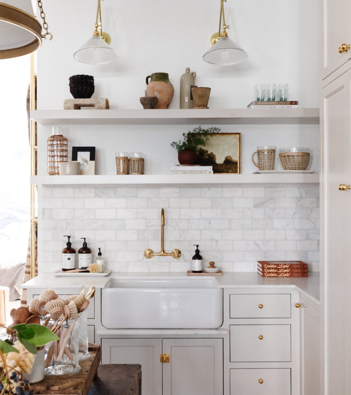
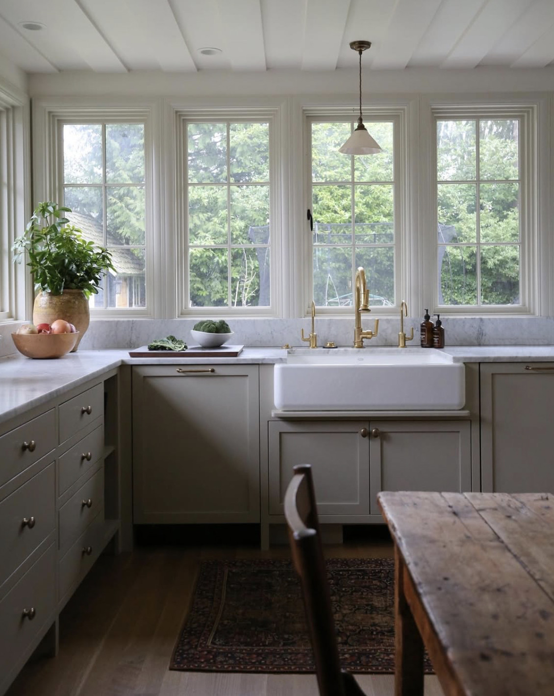
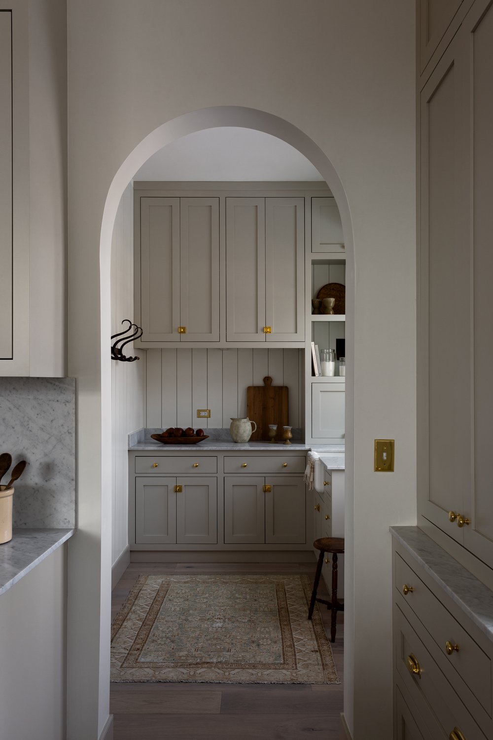
What makes it work? Good greige paint colors balance warm undertones with gray undertones, creating something that feels fresh. No yellowing, no sterile feeling. That’s why you’ll see it everywhere, from kitchen cabinets to living room walls, it just works.
Greige Paint, It’s All About Undertones
Getting greige right starts with understanding undertones.
Most greige colors lean either warm or cool. Warmer ones have a hint of taupe that makes spaces feel cozy, while cool undertones pull more gray.
Cooler shades can work in rooms with lots of natural light, but they’ll turn a bit “cooler” fast in darker spaces.
Designer Tip: Greige changes throughout the day.
Morning light pulls out warm undertones, afternoon sun emphasizes the gray tones, and it gets even trickier in a north-facing room.
That’s why interior designers usually turn to warmer greige shades, they read more consistently as the light shifts.
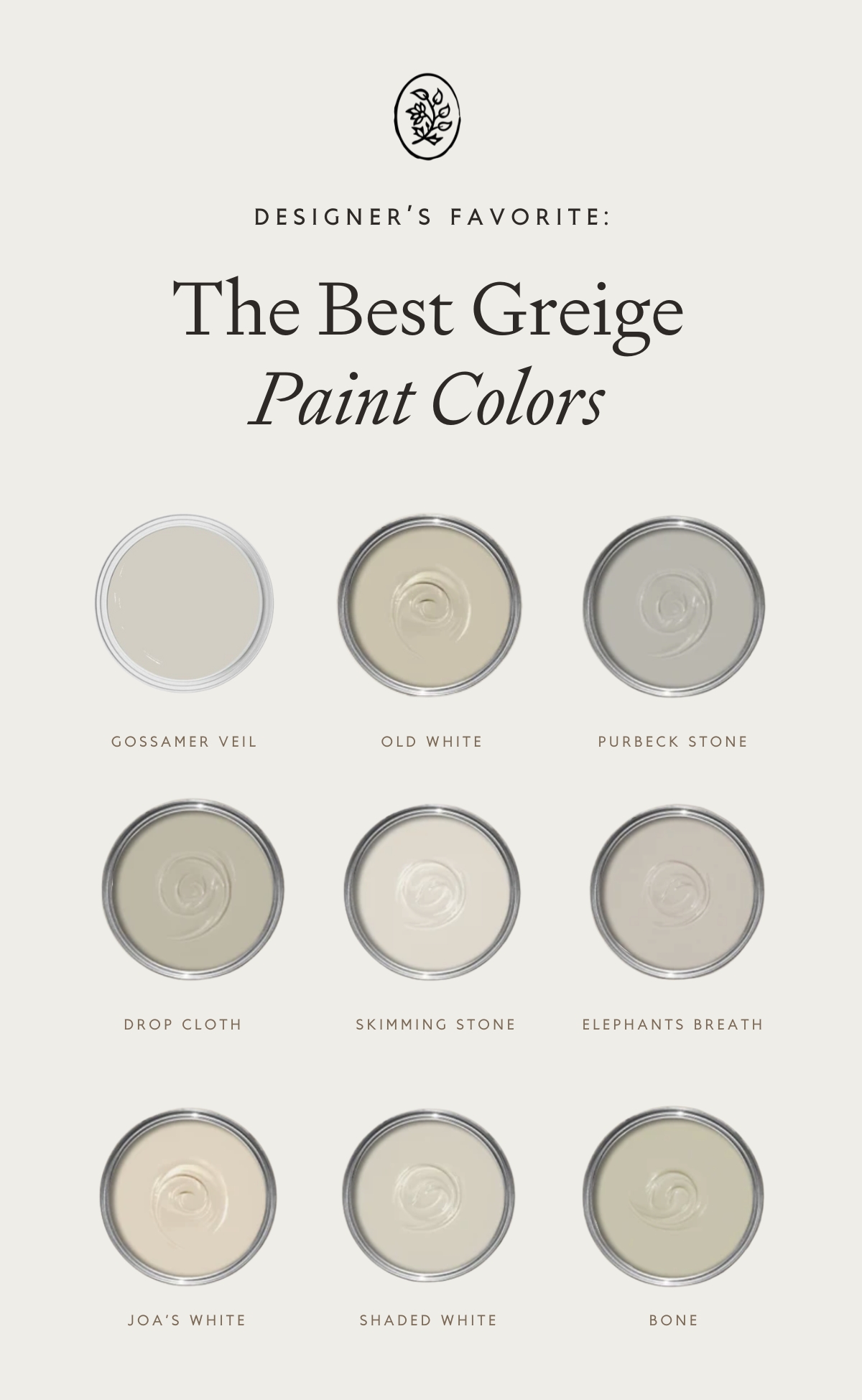
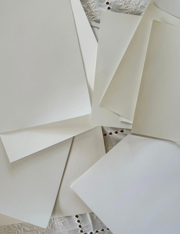
The Best Greige Paint Colors
Do you have a wall that needs painting? Before you grab the first greige paint swatch you see, here are different greiges that are worth your time.
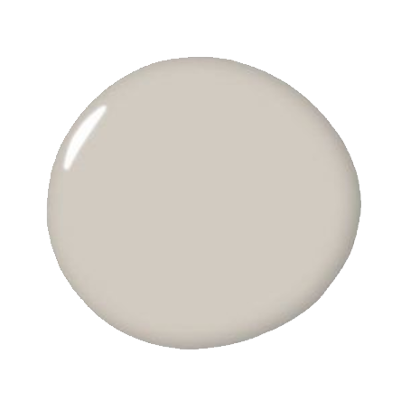
Sherwin Williams Gossamer Veil

Sherwin Williams Gossamer Veil? It’s quickly becoming a favorite, and for good reason.
The mix of warm undertones and gray tones blend beautifully – not too warm, not too cold. Plus, its middle-range light reflectance value makes it look great in both bright and dim spaces.
You’ll love how this wall color performs in rooms with lots of natural light, and how it looks on cabinets!
It morphs slightly as the sun moves, but never gets washed out. It works well in north-facing rooms, too, where most grays turn too cool. In an open floor plan? Even better, it flows from room to room without any awkward transitions.
I’ve seen Gossamer Veil used in almost every main living space. From a cozy living room to a beautiful home office, it creates a perfect neutral color backdrop.
It looks especially elegant paired with natural materials and plays well with patterns and accent colors.
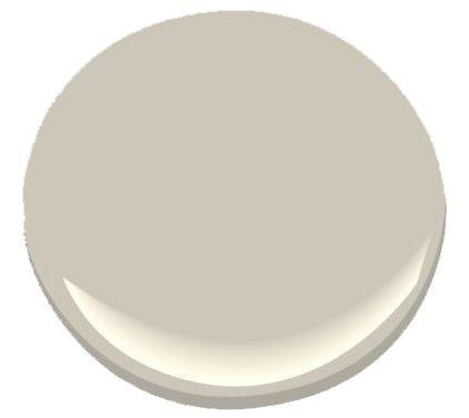
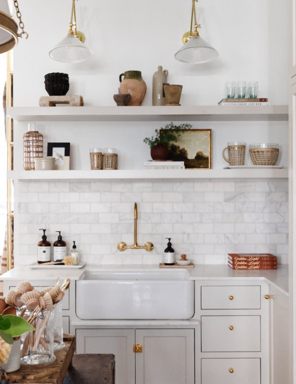
Farrow & Ball Old White
Farrow & Ball Old White is one of my favorite greige paint colors. It’s been around since before “greige” was even a thing.
Unlike modern neutral paint colors that can feel a bit flat, Old White has this subtle depth that changes with the light.
In north-facing rooms, it leans into its hidden green undertones, creating this soft, vintage feel. Put it in a space with lots of natural light, and it shifts to a sophisticated, warm gray that feels both classic and current.
That signature chalky finish is what makes it special. It’s not trying to be the smoothest or shiniest wall color. Instead, it creates a gentle appearance that brings character to a room. It’s stunning in a formal dining room or traditional living space, allowing for the historical character to shine through.
Old White works well in contemporary spaces, too. Whether updating a farmhouse kitchen or adding warmth to a modern space, it brings a lived-in elegance that is difficult to achieve with other popular paint colors. It’s especially good at making a room feel larger without feeling cold, a rare trick for any neutral.
As a designer, this is one of my very favorite paint colors.
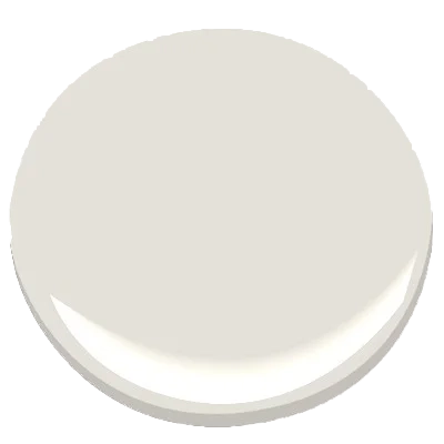
Farrow & Ball Purbeck Stone

You’d never guess a paint named after a rock could be this interesting, but Purbeck Stone is an exception. While other neutral paint colors can call a bit flat, this shade has layers.
In a well-lit dining room, it shifts from this crisp morning gray to something warmer by late afternoon.
The cool tones never get harsh either; they just sort of… settle in. If you have a room with lots of natural light, you’ll see what I mean.
It’s become my go-to for color for planning a whole house when clients want something with more depth than your typical white. It has a natural confidence.
Read More: The Best Farrow & Ball Paint Colors
Farrow & Ball Drop Cloth
Drop Cloth has a beautiful way of sitting between warm and cool. Talk about versatile, it’s easily one of the best greige paint colors I’ve worked with as a designer.
The way it changes through the day is what sells it. Morning sun brings out a bright, fresh quality. By evening, the color mellows into a soft, cozy ambiance.
What makes it useful is how it plays with others. Pair it with Shadow White, and you’ll have an effortless, sophisticated look. Or go bold. I had a client pair it with Railings on their trim. The contrast was perfect – modern but not trying too hard.
Most colors lean either traditional or modern, but Drop Cloth, can go both ways!
Farrow & Ball Skimming Stone
Skimming Stone is a greige I have found myself coming back to often lately. It’s becoming my go-to greige for clients who would like a bit of depth, but aren’t ready to jump into darker territory.
The name fits as this color has that smooth, fresh plaster look.
What’s really lovely about this warm neutral color is how it handles light. Put it in a room that gets a lot of natural light for a fresh and bright look.
For color schemes, it’s surprisingly flexible. It pairs beautifully with Elephant’s Breath if you want a sophisticated, layered look. Strong White works, too, if you want more contrast.
This is a great color because it doesn’t lock you into one style, giving you versatility in your furnishings.
Choosing the Right Sheen
Paint sheen is one of those things that seems minor until you get it wrong. The finish you pick will change how your perfect greige paint color comes across.
More gloss means more light bounce, which makes colors look lighter. Less gloss gives you deeper, richer color but comes with its quirks.
After helping clients select paint colors for hundreds of rooms, I have strong opinions about which finish goes where. So let’s talk flat finish…
Flat / Matte
I am partial to a flat finish, which is the common finish “look” you’ll see with Farrow & Ball.
This beautiful chalky finish is what helps make a greige paint color feel a bit more modern.
Here’s what makes flat great for greiges:
- Makes complex undertones pop (finally got Benjamin Moore’s Revere Pewter to look exactly how I wanted).
- Hides wall imperfections.
- Appears more “expensive”.
Why some shy away from a matte finish:
- Scuffs show up easily (especially on lighter greiges).
- Cleaning can be more difficult than paint with a higher sheen.
- It is not a good option for bathrooms.
Color experts typically love flat finish for greiges in:
- Living rooms (makes those subtle tones pop)
- Bedrooms
- Formal dining spaces
- Media rooms (no glare issues)
- Home offices that need to look fancy on Zoom
Eggshell
Eggshell finish has just the right amount of shine to be practical but won’t show every wall flaw. Durability is also decent, not as wirable as a semi-gloss, but it can handle a good wipe-down.
Makes it perfect for:
- Family rooms
- Kitchens (except backsplash areas)
- Hallways
- Kid’s rooms
- Working home offices
I’ve tested most of the best greige paint colors in different finishes, and eggshell does appear differently.
Light-wise, has a subtle glow that transforms greige colors. Just watch out in sunny rooms, though. Eggshell paint can make purple undertones pop out more than you might want when sunlight hits it.
Satin
Satin has become a popular choice in modern homes. It’s that sweet spot between matte and glossy that actually works pretty well when used intentionally.
Best used in:
- Bathrooms (handles moisture properly)
- Kids’ playrooms (wipes clean in seconds)
- Mudrooms
- Laundry rooms
- Busy hallways
Keeping it clean is pretty straightforward. Avoid using magic erasers or special cleaners because they can leave shiny marks behind.
You only need soap and water. Also, don’t skip out on wall prep, satin tends to show every bump and dip. And if you’re stuck on Zoom calls all day, watch out for glare in rooms with a lot of light. Trust me on that one. ;)
Semi-gloss / Gloss
Semi-gloss isn’t for everyone, but is a great stylistic choice when used intentionally. I love using it for modern, cool spaces.
Where it makes sense:
- Bathrooms (especially shower walls)
- Kitchen backsplashes
- Window trim
- Door frames
- Wine rooms or libraries
Light bounces off this finish. I used Classic Gray once in a windowless powder room and the semi-gloss practically doubled the little light. But skip it for large walls unless you want that super modern look.
Paint Application Tips
Wall prep can make or break a paint job because even tiny dings and dents will stick out if you skip the prep.
Surface Prep recommendations:
Clean walls with TSP
Fix holes properly (those quick-dry fillers usually show through)
Sand high spots or scuffs with a light grit sandpaper
Prime dark spots (especially with lighter colors)
The Key to Greige Paint: Light
Lighting is tricky no matter what, but especially with grey paint. I’ve tested many a gray that looked perfect until evening…when it can turn purple or green.
To get the color right, you really must test the shades in:
- Early morning
- Mid-day
- Sunset
- With your actual room lights on
Testing methods
For testing, skip the paint chips. Designers very rarely use these. If at all, it’s just a starting point.
Order a real sample from Samplize or paint a big poster board. Move it around the room throughout the day to truly test the color and catch any undertones you’d have missed otherwise.
DIY vs Pro?
Is it best to paint on your own or hire someone? It depends on the project scope and your skill level (and patience). If it’s just a bedroom, go for it. However, if you’re tackling a whole house, maybe call someone. Sometimes, paying a professional costs less than fixing DIY whoops.
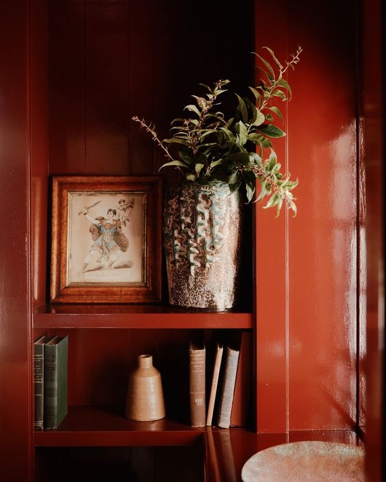
Styling with Greige Paint
Greige walls are great, but an entire greige home will feel well…greige. I love pairing a beautiful greige paint with other colors throughout a home through paint and textiles.
Pastels or jewel tones are my go-to combinations for greige paint. Navy blue or deep greens work beautifully, especially through plants, rugs, or furniture.
Some designer faves:
- walnut furniture (seriously, it’s great)
- bronze or brass finishes
- textured upholstery
- rattan pieces
- anything with a print or pattern
Feel free to get creative with color in accents – burnt orange, dark teal, even purple. Tip: stick to two or three bold colors and use the color wheel for help.
Read More: Selecting the Perfect Palette
Why Greige Paint Wins
I have spent a lot of time testing different grays and beiges. The best greige paint colors actually work well for a timeless look, that’s one of the reasons I love Old White so much.
In conclusion, you’ll love Greige in your home, but be sure to:
- Test before you commit
- Pay attention to your room’s light
- Turn to classic, rich colors (Farrow & Ball are best)
Greige pairs well with modern or traditional furniture, handles trends, and will be a great option for years to come.
Greige certainly shifts with the light, but its underlying warmth allows it to be more adaptable than a traditional grey. A great option for walls that aren’t white, but still read natural. Designer approved!
Explore all about Paints and Finishes
Be sure to check out our paint-related articles to dive deeper into color trends, techniques, and tips for your next project! Whether you’re looking to refresh your living room or discover the best finishes for your exterior, we’ve got you covered. Stay inspired and get the best advice for all your painting projects!
Designer’s Review: Sherwin-Williams Pure White SW7005
The Best Red Paint Color Ideas to Transform Your Space
A Designer’s Guide to the Best Warm White Paint Colors
How to Choose the Best Interior Paint Colors for Your Home
A Green Bathroom Remodel You’ll Love
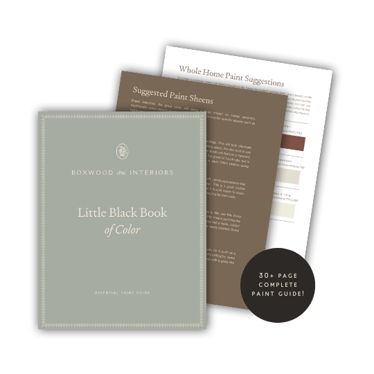
instant download
Little Black Book of Color
Download our free paint guide! Get our expert guidance for your entire home with our 30 page paint guide.
The exclusive Boxwood Avenue paint guide to achieve a perfectly cohesive palette in your home!
very informative
This post makes gaming here even better! Hypakle
I love how you explained the indertones of greige and how lighting can completely change the way a paint color looks in a room.
99 nights in the forest