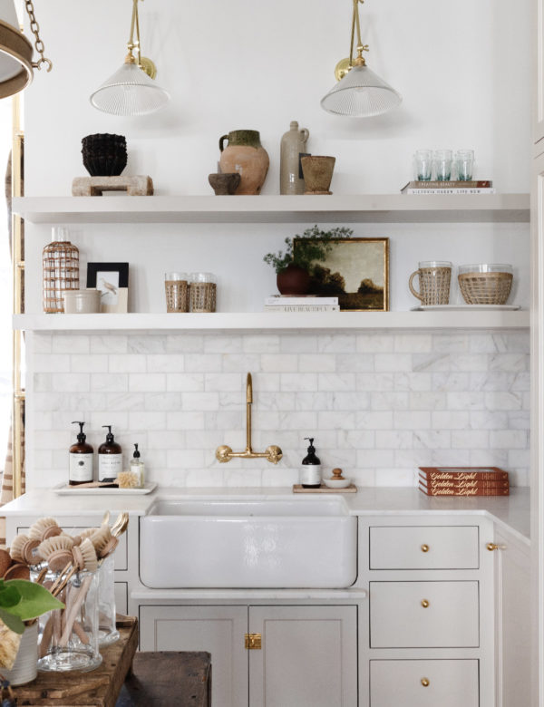
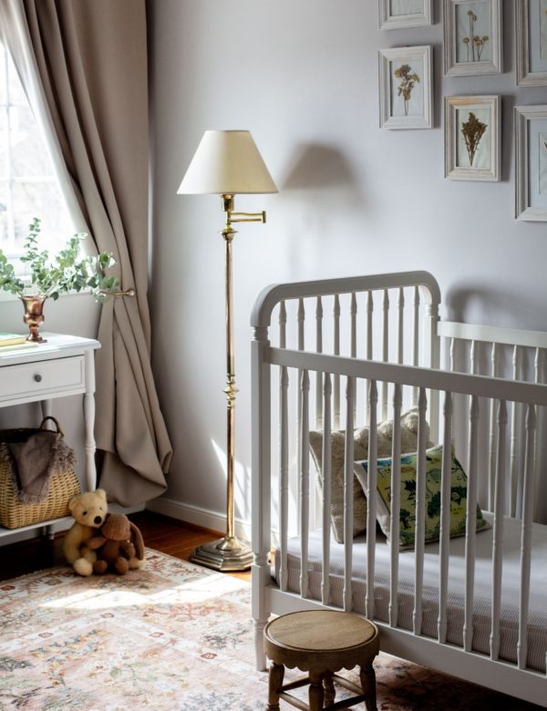
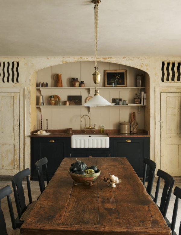
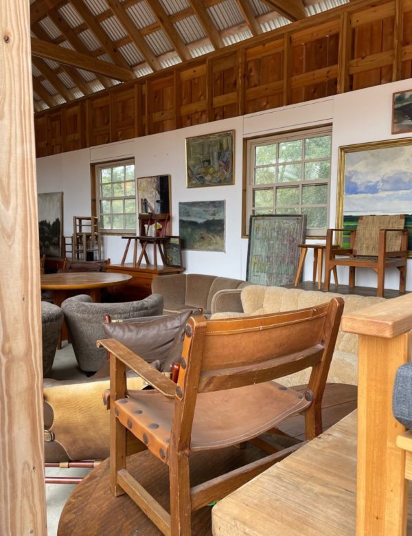
Last week, I started a design presentation, grinning, “Okay, hear me out: let’s paint the kitchen…red!” I said to our senior designer.
She too, started grinning. The perfect red kitchen: a sun warmed clay color, inviting a slow morning with a cup of coffee. Here’s the thing, red paint – in the right space – can be a powerful design tool!
That’s the funny thing about red. We get hung up on memories of that one restaurant with the aggressive crimson walls or our aunt’s questionable 90s dining room that looked like it was dripping in wine.
As evident in our kitchen design plan, seeing the red, purple, and blue color palette come seamlessly together, I have to admit red just might be my new favorite color.
Trust me, I know choosing a red paint color feels like a big leap. Rest assured though, after seeing dozens of rooms transformed by the right shade of red, I’m convinced it’s worth the jump. Ready to learn what interior designers know that most people don’t when it comes to selecting red paint?
I’m so glad you asked, let’s dive in!

Why Red? (And Why It’s Not as Scary as You Think)
While some think red paint is a statement color reserved for those willing to go bold, as an interior designer with an attuned eye for paint colors, I am here to assure you: red paint colors can work just about anywhere, even if your style if more muted.
From a darling front door to the walls of an elegant living room, the trick is finding the right way to use it. In this post, I will share my best design tips to selecting red paint with confidence.
Design tip No. 1: Select the Correct Hue
When selecting the perfect paint color, nailing the hue is half the battle.
For red paint, it’s important to select a shade that is complimentary to the setting and style of the home (the context of the space).
Red in particular doesn’t necessarily have to shout. A lighter shade can warm up a room without overwhelming it, or a bolder richer hue can instantly create depth.
And while we’re on the topic…consider this free design advice: never do a red accent wall. Instead, paint the entire room for a more elevated look.
The psychology behind red is fascinating. Studies show it stimulates conversation and appetite (there’s a reason so many restaurants use it), but it goes a long way beyond that. The right red can make a room feel intimate at night and energizing during the day. It’s like having two rooms in one – and that’s something no other color pulls off quite the same way. More on selecting the perfect color.
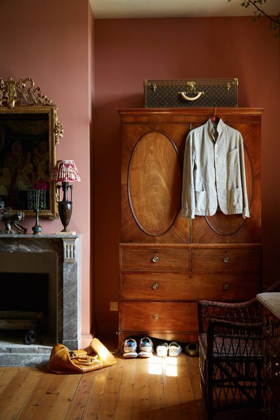
via Finacial Times: Peter Copping’s French Fairytale House
instant download
Little Black Book of Color
Download our free paint guide! Get our expert guidance for your entire home with our 30 page paint guide.
The exclusive Boxwood Avenue paint guide to achieve a perfectly cohesive palette in your home!
Red Paint 101: Finding Your Perfect Shade
My first experience with red paint did not go well. I was 14…but still.
I saw a bold bright red and thought, “Perfect!” Three coats of paint later, my childhood bedroom looked like the inside of a fire truck. At the time, I actually loved it, but I don’t think your goal is a teenager’s bright red bedroom?
Picking red paint isn’t as simple as grabbing the first color you like.
As I have become much more knowledgable in color theory and paint selection, and as an interior designer, I have quite the opinion on the subject. Although, I still kinda like my red bedroom, in a nostalgic way.
Here’s what I’ve learned:
The secret to picking the perfect shade is about understanding undertones. Warm undertones lean orange (think brick or terra cotta), cool undertones show hints of blue (like that perfect merlot color), and true reds sit right in the middle.
Each shade will transform your space in a different way. Before you commit to any actual paint colors, analyze your space’s lighting and existing decor to create a cohesive color palette.
As with any color, light can dramatically alter the way red paint is perceived in your space. That perfect shade you saw at a hotel in Spain might not translate the same way in your own home.
Whenever I am working with a client on a paint consultation, I always recommend test samples on different walls (samplize is a great tool for this). Review them in the morning, midday, and evening to ensure you are happy with the color.
Selecting Paint Sheens
In addition to selecting the correct shade, selecting the perfect sheen is just as important.
High Lacquer: I love using a high gloss sheen for projects that call for a bit of drama. Think a wine room, library, closet, or powder room. In this case, I recommend painting the trim and ceiling all the same color.
Matte or Flat: When the shade is more muted and the space need a calming feel, I like
Satin: I like using a satin finish on trim. When painting millwork, this is a great option to add some depth.
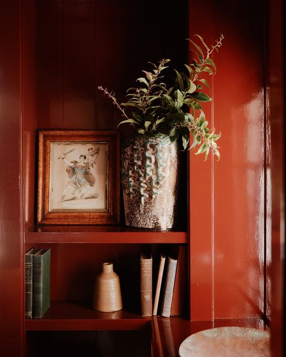
via Chused & Co: Connecticut 1860s Farmhouse
Red Paints Designers Can’t Stop Using
Just like white paint, there are a handful of tried-and-true red paint colors that designers turn to time and time again.
Spoiler: it’s not always the ones you’d expect!
The tried-and-true favorites
Heritage Red by Benjamin Moore is a designer go-to for good reason. Heritage red in a high sheen finish on front doors or furniture is a wonderful option. It’s one of those historical colors that never goes out of style. This will create a “pop” of color, and I wouldn’t necessarily use it in a whole room.
Farrow & Ball’s Rectory Red is a perfect shade for sophisticated drama – especially in a lacquered finish. Try this in a library or powder bathroom. It would also be amazing in a laundry room!
Sun Dried Tomato is one of my favorite red paint colors and pairs beautifully with greek villa (a gorgeous bright white). This color would be excellent on a front door or in a study.
Rockwood Red is a classic red from the historical collection, so you know it will have longevity. This is a great shade for those who prefer a richer, darker red in their space. I would use this in a library or even a bedroom. I love Eating Room Red by Farrow & Ball for the same reasons!
Surprising red paint colors
For something different, try Bittersweet Autumn by Donald Kaufman. One of those dark hues you save for special occasions, perfect for a classic front door or even a dining room. This is a bold color, and if you pull this off, you’ll be thrilled!
Red Paint Colors of the Moment
Radicchio from Farrow & Ball is a striking red that leans a bit magenta. This can be used on ceilings or to douse a playroom with color.
Clare Paint’s Big Apple is a wonderful rich red with warm undertones. It’s perfect for a kitchen or even dining room. As a designer, I’d pair it with some lovely wallpaper.
Pro tips from the experts
If you’re not ready to commit to a full room, try a red kitchen island (I’d go with “Beetroot“), or go for it in a smaller space like a powder bathroom or closet. Remember, with red acrylic paints, a little often goes a long way. Accent pieces or ceilings are a great way to “dip your toes in”, but never do just an accent wall.
Note that reds need additional coats of paint, so keep this in mind when sampling – don’t panic if it takes more paint to get that magazine-worthy look – it’s normal with reds.
Light Considerations for Red Walls
Remember, light changes everything when it comes to paint, especially red walls.
South-facing rooms keep reds looking warm and true – more aligned with how they appear on the paint chip. However in north-facing spaces, reds tend to cool down and get muted, especially mid-afternoon. One is not better or worse, just different.
The time of day is important, too. Morning light shows reds clearly and brightly, while evening light deepens them.
White trim makes red walls pop more, while cream trim softens things. While this may be inherent to you, it makes a huge difference in how the color turns out, so be sure to keep it in mind.
Another sneaky designer tip? Your light bulbs matter just as much as sunlight!
LEDs make reds look sharper (sometimes too sharp), while regular bulbs warm them up. The trick is to test your color in three spots: the darkest corner, right under your lights, and next to your windows. That way, you won’t get any surprises after you’ve painted the whole room. As a designer, I only source warm natural lightbulbs, even if we are buying LED.
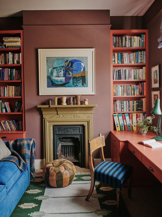
via Home & Garden UK: A rambling former vicarage in south London brought to life by Tamsin Saunders
Coordinating with Red Paint
Red plays nice with more colors than you’d think. Warm browns work great, and black always adds sophistication. Keep in mind, cream works better than a stark white paint if you’d like to keep things light.
If you know me, you know that I am a big fan of utilizing color theory when selecting paint colors. I love pairing red with green, and no, it doesn’t need to look like “Christmas”! Make sure you’re using muted colors. I also love red with purple or orange!
When pairing furniture with red paint, dark wood is your friend. Those vintage mahogany pieces you’ve got stored away? They’ll look amazing against red walls. Glass tables or metal frames help break the color without making the room feel busy. I like warmer metal tone such as oil rubbed bronze or brass.
When it comes to textures, think layers. Smooth leather looks rich against red walls. Chunky knit throws and nubby pillows add depth. Natural materials like woven baskets, sisal rugs, or raw wood bring warmth and keep the room from feeling flat.
My designer option is to skip anything too shiny or metallic – one reflective surface is enough. And if you’re using patterns, keep them simple. Let the red be the star.
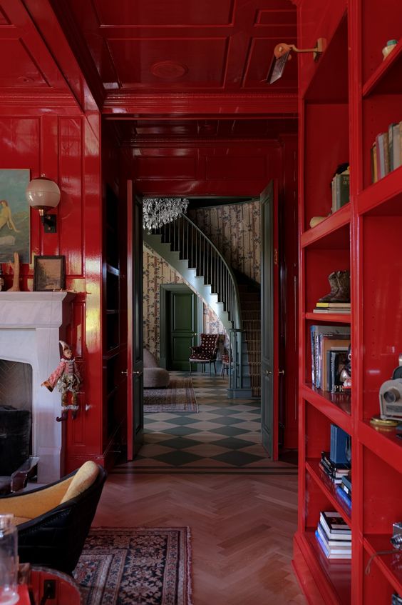
via Pierce and Ward
Common Mistakes to Avoid
Many people miss by rushing in, selecting a color they love in the store, paint a whole room, and then realize it’s too bright or dark.
First rule: paint big test patches – at least 2 feet square. Red looks different when it covers more space, and those little strips from the store won’t tell you the real story!
Testing needs time. Paint your samples on at least two walls – one near a window, one far from it. Live with them for a few days. Watch how they change from morning to night.
Another little tip? Don’t paint samples right next to each other – it doesn’t provide enough contrast for your eyes to differentiate the colors properly. Leave space between them if you’re choosing between reds.
When it comes to painting a room red, don’t skip primer. Red needs a solid base, or you’ll coat after coat. Red often need extra coats of paint, so you may find you need to buy a bit more than other colors call for.
Finally, don’t worry if the first coat looks patchy. Red paint almost always looks a bit “off” until that last coat goes on. Trust the process.
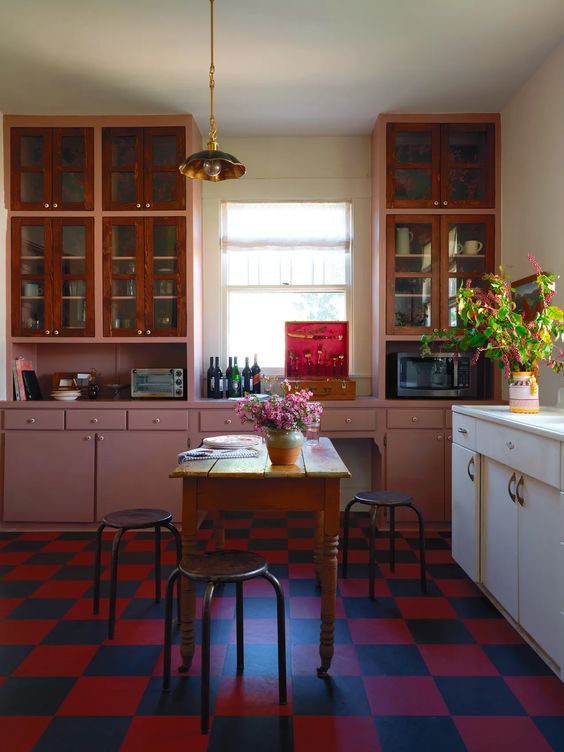
via Living Small by Laura Fenton
Maintenance and Care
Basic cleaning is simple: warm water and a soft cloth usually does the trick. Stay away from harsh cleaners – they can make red walls look dull.
Touch-ups can be tricky with red. Here’s what works: keep some of your original paint (label it with the room and date). Small touch-ups look better if you feather the edges with a dry brush. You’ll probably need to paint the whole wall section from corner to corner for bigger scuffs. It sounds like overkill, but it looks much better than spot-fixing.
About longevity – red walls can fade in sunny rooms. Good quality products help, but you might notice some fading after a few years, especially on south-facing walls.
Using curtains or blinds during the harshest sun hours helps. If you used inexpensive paint, you might see fading sooner. Consider repainting every 5 to 7 years to keep that red looking fresh.
Most important tip? Save your paint info. Write down the brand and color name, and finish somewhere safe. Take a picture of the paint can label, too. Nothing’s worse than needing to match a red paint color from memory.
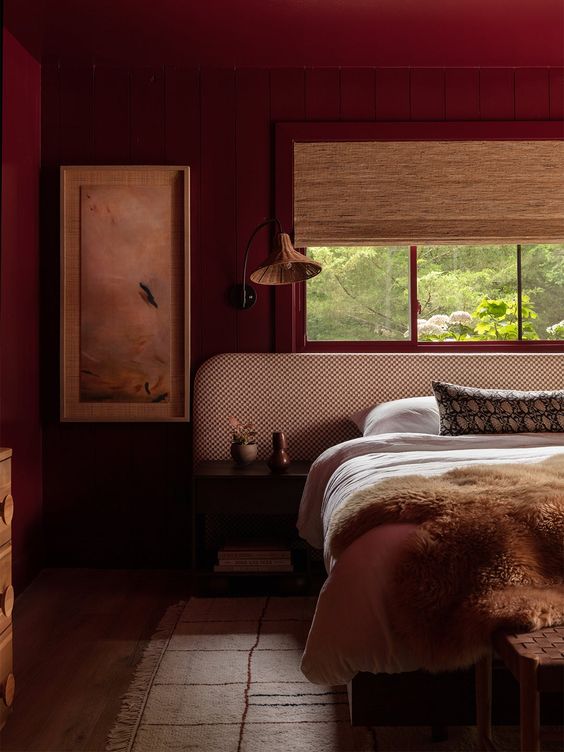
via Domino, Photography by Rett Peek
Conclusion
Red paint isn’t as scary as people make it out to be. Sure, it’s bold – but that’s the point.
Get the basics right (good testing, proper lighting checks, quality paint), and red can transform a dull room into something special! Maybe you’ll go all-in with four red walls, or perhaps just an accent piece. Either way, it’s worth the effort to get it right, and I hope this post was helpful for you!
Keep in mind, there’s no such thing as a “wrong” red – just the wrong red for your space. Take your time picking the proper shade. Test it properly. Watch it change throughout the day, and don’t let anyone talk you out of it if red is what you really love!
At the end of the day, paint is just paint. If you try a red and it’s not working, you can always paint over it. From what I’ve seen, people who take the time to choose and test their red carefully usually end up loving it.
I hope you feel inspired to delve into your own monochromatic design but if it seems a little too intimidating, I know someone who can help… ;) Email us at design@boxwoodavenue.com to share more about your project!
Explore all about Paints and Finishes
Be sure to check out our paint-related articles to dive deeper into color trends, techniques, and tips for your next project! Whether you’re looking to refresh your living room or discover the best finishes for your exterior, we’ve got you covered. Stay inspired and get the best advice for all your painting projects!
Designer’s Review: Sherwin Williams Pure White SW7005
Designer’s Top Picks: The Best Farrow and Ball Paint Colors
A Designer’s Guide to the Best Warm White Paint Colors
How to Choose the Best Interior Paint Colors for Your Home
A Green Bathroom Remodel You’ll Love
Luxury Designer’s Top Picks: The Best Greige Paint Colors

instant download
Little Black Book of Color
Download our free paint guide! Get our expert guidance for your entire home with our 30 page paint guide.
The exclusive Boxwood Avenue paint guide to achieve a perfectly cohesive palette in your home!
